About Aisol Spec Sheet
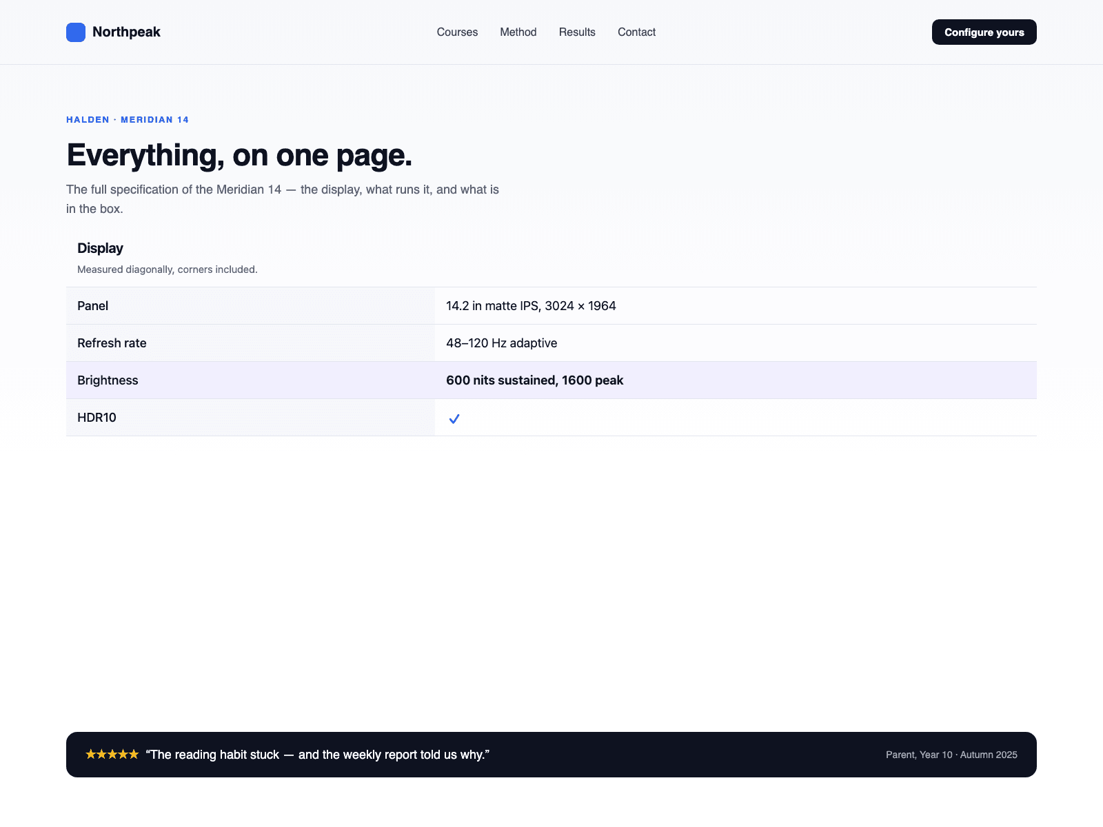
Build a spec sheet from a CMS collection in three steps. Drop a Collection List into the Rows (CMS) slot and turn off its Pagination so every row is read. Inside the item, name text layers Group (for example Display), Label (Weight) and Value (1.2 kg), plus an optional Note and a Highlight layer whose visibility you bind to a toggle. Publish: every CMS item becomes one row, and groups appear in the order they are first seen.
The component reads your Collection List and draws its own spec rows; the original list stays hidden and is never changed, and a Load more button inside it is hidden. Initial count shows only the first N rows from the Collection List with a Show more button that reveals N more per click; 0 shows all.
On a CMS detail page, bind one text field to Spec text instead: one row per line as Group | Label | Value | Note, or Label | Value under the last group. A line without a bar starts a group and a leading star highlights the row. No CMS yet? Type Groups and Rows in the panel.
A real definition list: each group is a heading at the level you choose, each row a term and its value. Values that are exactly yes or no become check and cross icons with the words behind them.
Two layouts: a two-column sheet that stacks label over value on phones, or grouped cards in two columns that fall to one under a width you set. The canvas shows the Collection List as it is; the sheet appears in Preview and on the published site. One product per sheet.