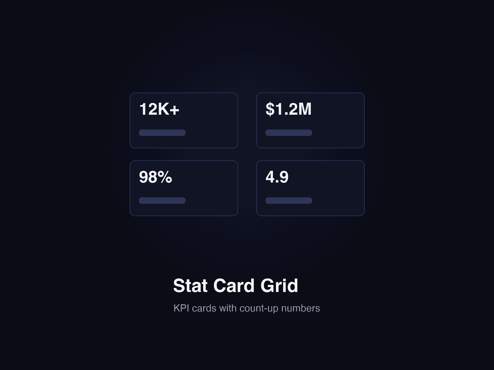
About KPI Stat Cards
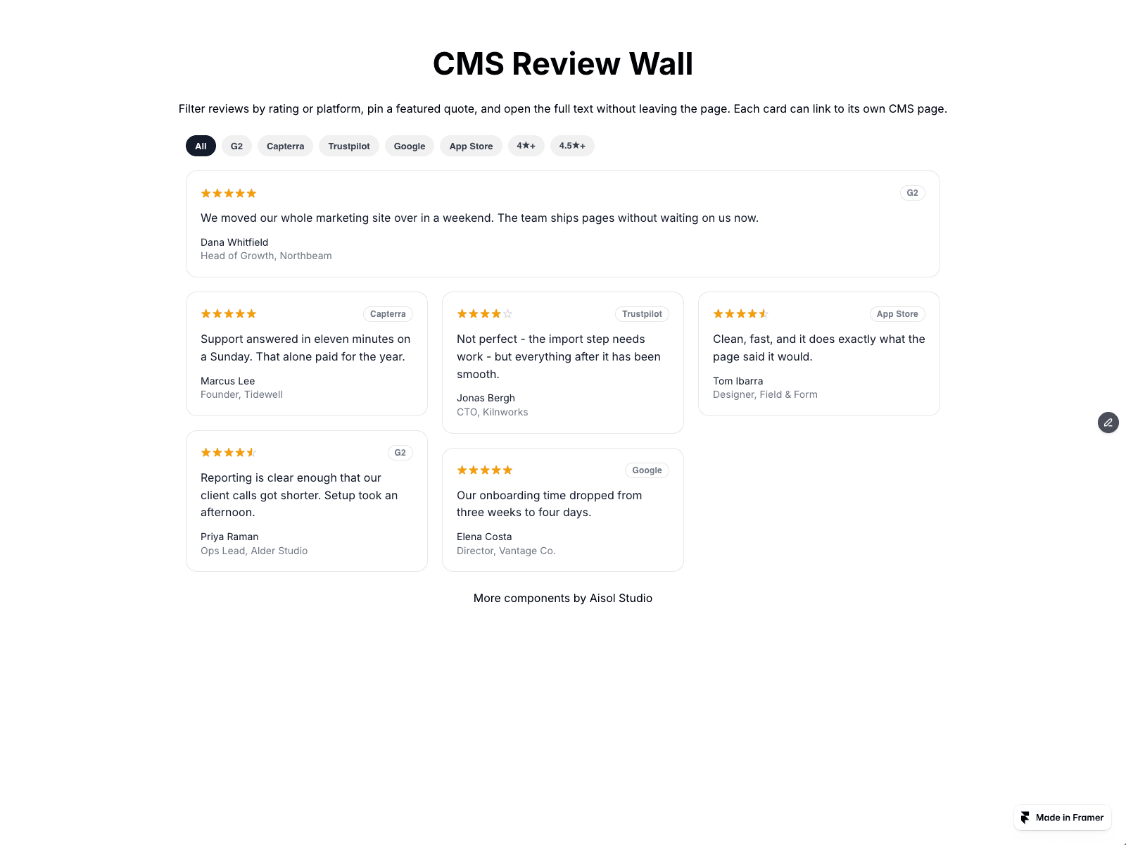
Show KPI cards from your CMS in three steps. Drop a Collection List into the Cards (CMS) slot and turn off its Pagination. In the item, name the text layers Label, Value, Delta and Note. Publish, and each CMS item becomes one card in the grid.
With Style CMS cards on, each item's Label, Value, Delta and Note layers are read and drawn as KPI cards in this component's style. Your list is hidden, never changed, so a Load more button is not shown. Your item's own background, borders and hover effects are not carried over. A link on the item makes the whole card a link. Initial count shows only the first N cards from the Collection List with a Show more button that reveals N more per click; 0 shows all.
Style CMS cards off shows your Collection List exactly as you built it; nothing inside it is changed. Single frames dropped in are always shown as they are.
Delta is read as text. "+12%" is a rise and "-3.1%" is a fall, shown in the Up or Down colour with a small arrow; these colours apply to the component's cards only. Turn on Lower is better for metrics such as churn or cost.
On a CMS detail page, bind fields to the single-card Label, Value, Delta and Note instead. Without CMS, type cards into the Cards list. Layer names can be changed in the panel.
Layout: a responsive grid. Columns and Min card width set how many cards fit per row.
Cards rise in one after another as the grid scrolls into view; skipped for reduced motion. The canvas shows the finished cards.