About Aisol Tabs
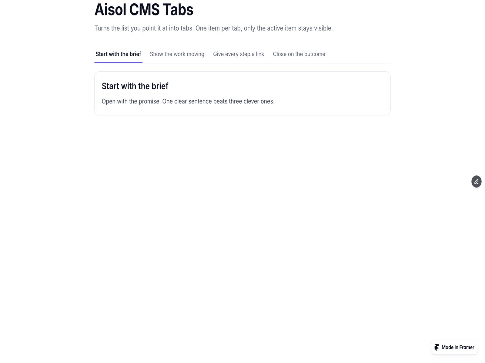
Aisol Tabs puts any section, CMS-bound component or other component into a tab panel. Add a label per tab and drop a component into the matching slot. Only the open tab's content is rendered; the other panels are empty placeholders.
Keyboard follows the WAI-ARIA tabs pattern. Only one tab is in the Tab order. Left and Right arrows move focus from the tab that has focus and wrap at the ends; Home and End jump to the first and last tab. "Switch" opens a tab as focus lands on it. "Focus only" moves focus without opening; Enter or Space opens the focused tab. Tab from the tab list moves into the panel: to its first link or button, or to the panel itself when it has none.
Deep link: ?tab=, #tab- or both. A shared URL opens the matching tab. The URL is updated with replaceState, so tab changes do not add Back-button history. Apart from the URL, nothing outside the component is read or changed.
Mobile: below a width you set, the bar scrolls sideways and keeps the open tab in view, or turns into a dropdown list (Up and Down arrows, Escape closes). Tested at 390 px wide with no horizontal page scroll.
Style: underline or pill, fill width, text size, font, accent, text, muted, tab fill, active fill and rail colours. The focus ring uses the accent colour. With reduced motion turned on, colour transitions are off.
On the canvas, the tab set in "Opens at" is shown.