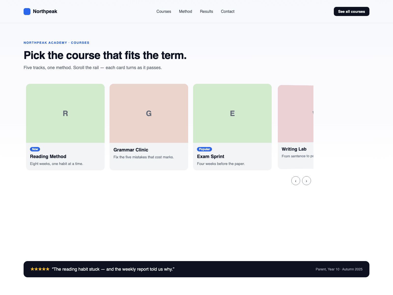
About Aisol Depth Cards
Use it with CMS in three steps: 1. Drop a Collection List into Cards (CMS) and turn off its Pagination. 2. Every loaded item becomes a card on the rail and turns, shrinks and fades like the built-in cards. 3. Name the layers inside the item Title, Body and Image; the rail styles them, fades the image and reads Title for screen readers.
A horizontal rail where each card turns, shrinks and fades as it leaves the centre.
Key features
- Real CMS cards. Each Collection List item becomes its own card, and the rail updates when the list changes. A Load more button is not shown.
- The rail shows copies of your CMS items. Links inside an item still work, but Framer hover and press effects and interactive components inside an item do not run on the rail.
- Turn off Style CMS Layers to keep your own card design.
- No scroll listeners.
- The browser does the scrolling and snapping. Arrow buttons and the Left, Right, Home and End keys move the rail.
- Reduced motion: cards stay flat.
- Card width steps down on tablets and phones; no sideways page scroll.
What you control
- Cards (CMS) slot, or hand-made Cards with title, subtitle, badge, image, alt text and link
- Turn, shrink, fade, card width, gap and radius
- Arrows, heading level, text size, font and four colours
- Rail name, position label and empty text
The canvas shows the Collection List as you built it; the depth runs in Preview and on the published site.