About Kathryn B. Portfolio
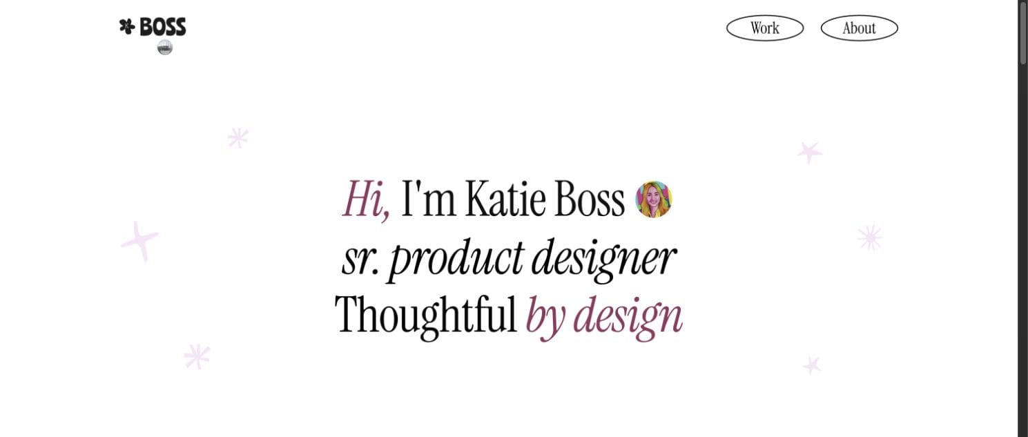
Kathryn asked for a portfolio that was functional and minimal, with “just enough Dolly Parton energy to keep things interesting.” Her old site showed her enterprise work and very little of her.
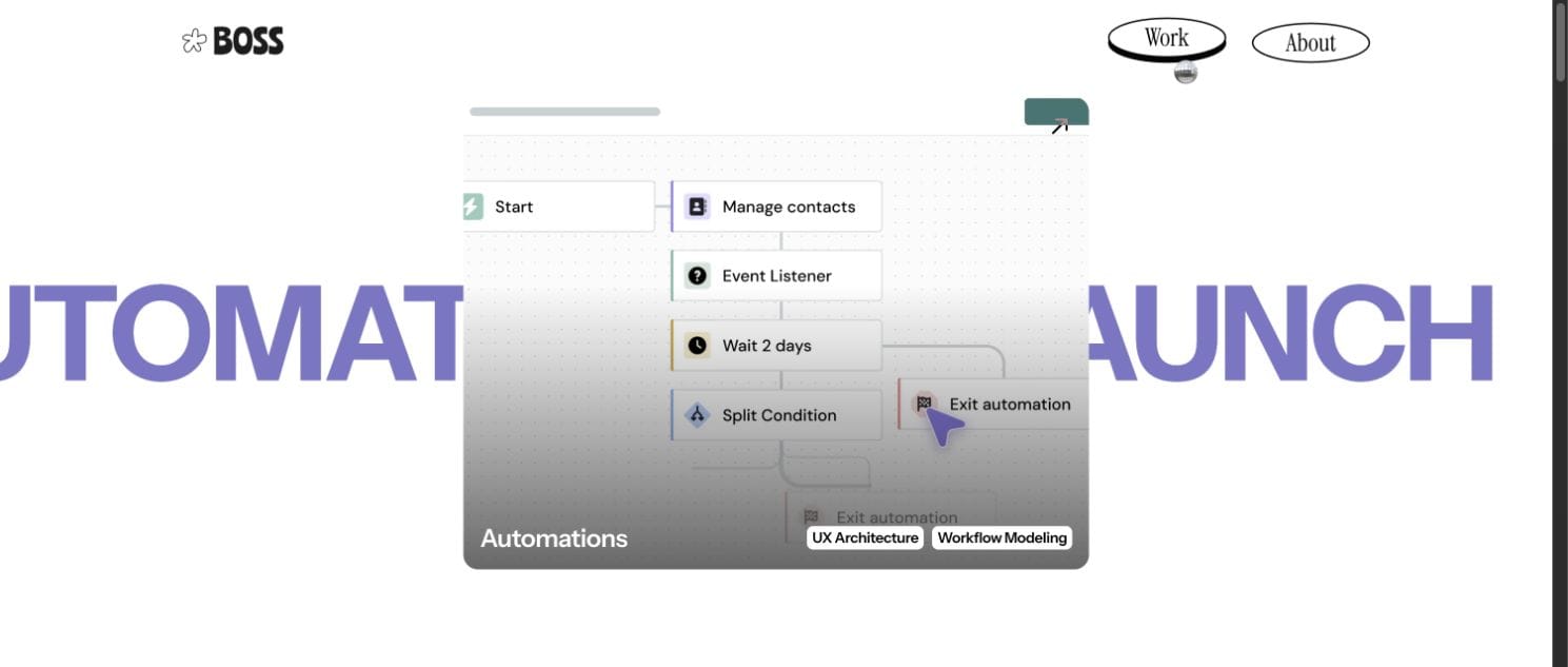
She designs complex communication tools used by millions, and her case studies are long: purchasing portals, mobile UX, AI work. The structure had to keep a recruiter oriented from the first section to the last.
Personality in the structure
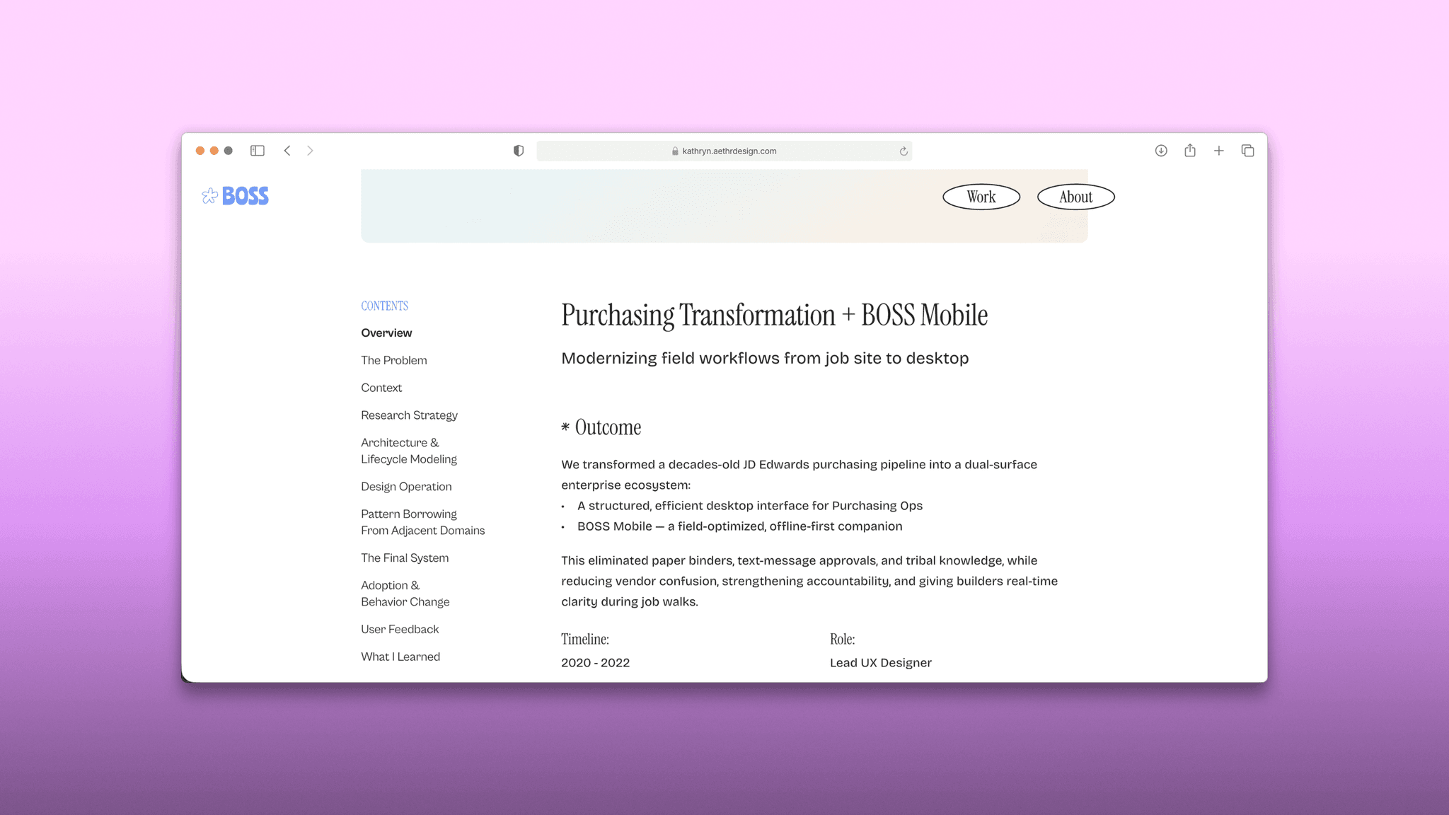
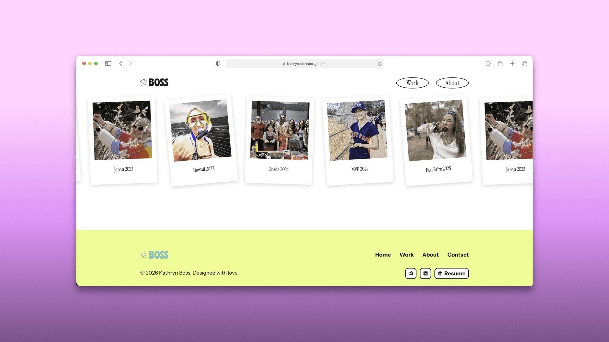
We built the Framer site around long-form case studies, with a custom sticky table of contents that keeps the reader’s place. Her character comes through in the layout: the skills section reads like a festival lineup, and a ticker carries her personal photography.
Her pink was tuned to #B2557F until it met contrast requirements, and the finished site recorded zero critical errors in a WCAG 2.1 AA check. A Framer CMS lets Kathryn add and update case studies herself.
See the sticky table of contents at work in the Kathryn Boss case study