The Velox Studio
The Velox Studio

The Velox Studio

Websites for companies building identity infrastructure. Research + website systems for making complex products easier to understand.

Creator5 Listings
The Velox Studio
The Velox Studio1mo

Identity Products Have to Decide What Part of the Product to Make Visible.

One thing stood out while comparing the websites of several Identity products.

They are all trying to make a largely invisible product understandable, but they don't make the same part of the product visible.

Clerk leans heavily on the interface itself. You see authentication components, organization switching, user management, and other parts of the actual product.

Descope makes the workflow visible. Its authentication flows show screens, paths, conditions, and the logic connecting them.

WorkOS leans more toward the system around the product: integrations, APIs, code, environments, and the admin experience.

Better Auth puts a surprising amount of the implementation itself on display through configuration, CLI commands, plugins, and code.

These aren't just different visual styles.

They're different answers to the same web problem:

What part of an invisible product should a visitor be able to see?

A screenshot can show what exists.

A workflow can show how it behaves.

A diagram can show how it fits together.

Code can show how it gets integrated.

A customer story can show what changed.

They are all useful, but they help the user understand different things.

The right representation depends on what you want the user to understand.
The Velox Studio
The Velox Studio1mo

Identity Products Become Harder to Explain as Capabilities Interact.

One thing became clearer while looking more deeply into Identity products.

A feature isn't always the most useful unit for explaining the product.

“Organizations” sounds like one capability.

But once roles, permissions, invitations, SSO and administration enter the picture, it becomes part of a much larger relationship.

Authentication works the same way.

A login is one moment in a longer chain involving identity, sessions, devices, policies and application access.

The interesting part is not that these capabilities are difficult to understand individually.

It's that their meaning changes once they start interacting with one another.

That is where a product explanation can become much more useful than a feature list: not by replacing the details, but by showing how those details fit together.

The product hasn't been simplified.

The relationship between the parts has.

The Velox Studio
The Velox Studio1mo

Identity Products Become Easier to Understand When the Relationships Are Visible.

A pattern kept appearing while studying Identity products over the past few days.

The more capabilities a product has, the harder it becomes for the website to explain not only what each capability does, but how the pieces relate to one another.

Mostly, the information isn't wrong.

The difficulty is that the relationships between those capabilities are often much harder to see.

A user belongs to an organization.

An organization has roles and permissions.

Authentication works the same way.

A login is one moment in a longer chain involving identity, sessions, devices, policies and application access.

The interesting part is not that these capabilities are difficult to understand individually.

It's that their meaning changes once they start interacting with one another.

That is where a product explanation can become much more useful than a feature list: not by replacing the details, but by showing how those details fit together.

The Velox Studio
The Velox Studio1mo

A polished interface can still feel obviously fake.

While refining Orven, a B2B identity infrastructure product, this issue came up.

The problem wasn't the concept.

It was the execution.

The issue was resolved through precise spacing, deliberate hierarchy, believable density, natural state changes, restrained motion, and consistent geometry.

The temptation was to add more UI.

That wasn't the answer.

The interface became more convincing when the existing elements were made more considered, more coherent, and more closely related to how a real product would behave.

The goal isn't to make a mockup look impressive.

It's to make the viewer forget they're looking at one.

Still refining this one!

The Velox Studio
The Velox Studio1mo

Been redesigning The Velox Studio lately, and it's made me think more carefully about how visuals communicate.

A visual shouldn't be there just because it looks good.

It should have a job.

It should explain something, reinforce the message, or help the visitor understand what they're looking at.

The Velox Studio
The Velox Studio2mo

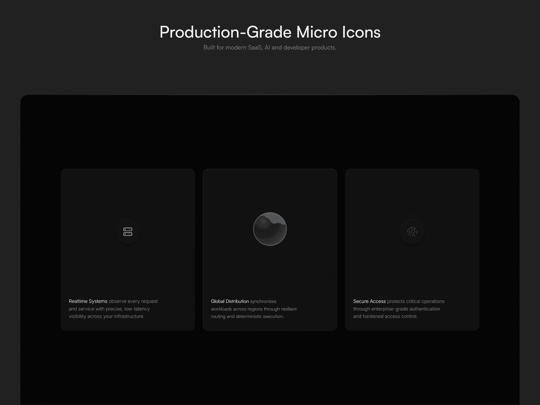
Production-Grade Micro Icons

A free collection of animated Framer code components for SaaS, AI, API infrastructure, and developer tools.

Built for polished feature sections, dashboards, docs, and landing pages.

Available now on the Framer Marketplace.

https://jazzed-surface-331467.framer.app/

The Velox Studio
The Velox Studioin Marketplace·2mo

Production-Grade Micro Icons

A free collection of animated Framer code components for modern SaaS, AI, API infrastructure, and developer tool websites.

Designed for feature sections, dashboards, documentation, pricing pages, and landing pages where subtle motion improves clarity without distracting from the interface.

Includes a production-ready showcase demonstrating how the icons can be used in polished product interfaces.

Available now on the Framer Marketplace.

The Velox Studio
The Velox Studioin Marketplace·3mo

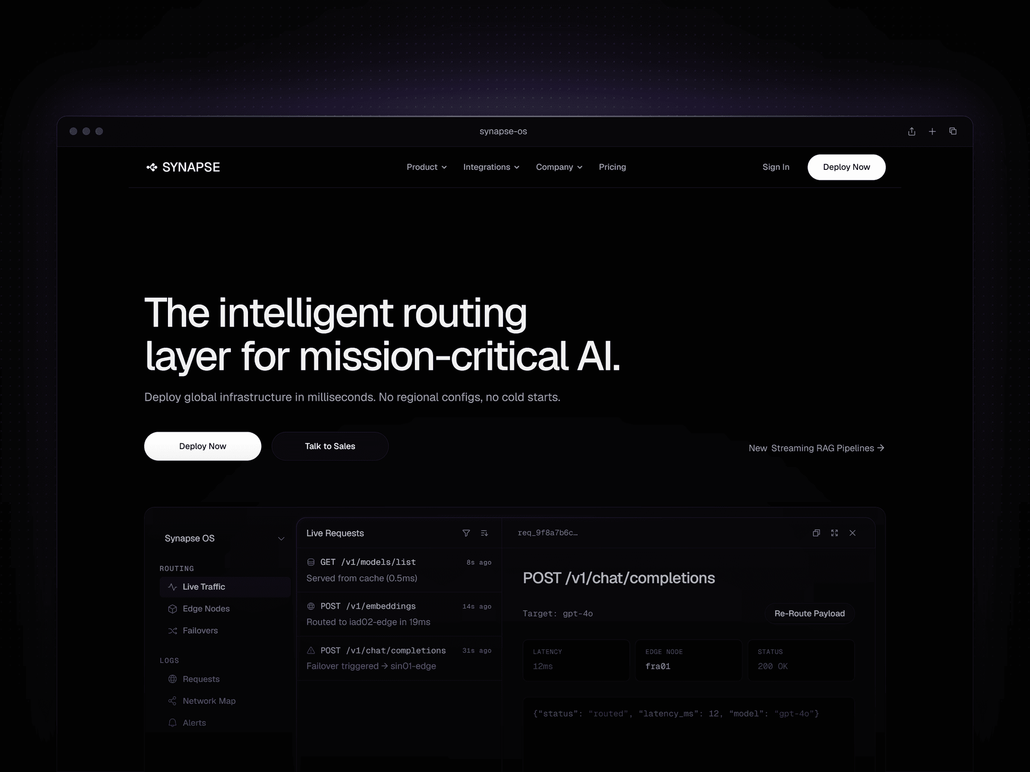
Synapse OS is officially live.

Best for B2B SaaS API infrastructure, LLMOps, and developer tools, Synapse OS is the definitive Framer template for enterprise launches.

This is not a website; it is a perception engine. The architecture spans 19 pages and includes custom React components for dynamic syntax highlighting, working CLI dropdowns, and a 4-pillar Framer CMS ecosystem (Developer Docs, Changelogs, Integrations, Customer Stories).

Every 1px border and background layer is strictly bound to a global token matrix, cutting deployment time from months to hours. This "Business-in-a-Box" architecture is engineered to maximize C-suite conversion and can be entirely rebranded by Framer 3.0 canvas agents in minutes.

The Velox Studio
The Velox Studio3mo

I just flipped the UI for Synapse OS, an API infrastructure Framer template I'm wrapping up, into this new aesthetic in just a couple minutes using a single Framer agent prompt.

I’m honestly loving this warm graphite and copper vibe. It really breaks away from the default pitch-black SaaS look everyone is doing right now.

The only reason the AI pulled this off without breaking the layout is because every single element across all 19 pages is strictly bound to global style tokens. Absolutely zero inline overrides.

If you build your templates with a strict token matrix, your buyers can use the canvas agents to completely rebrand the site instantly without touching the canvas. Less friction for them equals faster deployments, zero support tickets, and 5-star reviews for you.

You can poke around the live template here: Meridian | The Intelligent Routing Layer for Mission-Critical AI

The Velox Studio
The Velox Studio3mo

Heavy drop-shadows on dark mode interfaces usually just create optical mud against pure black backgrounds.

While engineering the Synapse OS API Infrastructure template, standard shadows were entirely discarded in favor of the Vercel grade "machined inner rim." It catches a razor-thin sliver of light on the top edge, forcing the UI to look like milled hardware rather than a floating graphic.

The exact Framer formula for this etched-glass aesthetic:

• Surface Fill: #0A0A0C at 66% Opacity + 24px Background Blur (any surface color works well)

• Inner Rim: Inner Shadow Y: 1, Blur: 0, White (#FFFFFF at 6% opacity).

This structural logic is deployed across all 19 pages, React components, and CMS hubs in the framework.

Check the live url to see the full build: https://synapsse-os.framer.website/

Launching soon!

The Velox Studio
The Velox Studio3mo

Currently engineering the next premium template: Synapse OS.

Adopting the machined 1px aesthetics of Vercel, Linear, Clerk, and Resend. Architected for API and Infrastructure platforms but designed for total fluidity. With the new AI canvas agents in Framer 3.0, swapping the core DOM to fit any adjacent B2B SaaS niche takes minutes.

Track the structural updates live at: https://synapsse-os.framer.website/

Curious, when you finally step away from the canvas, what's your go-to way to reset your brain? Need some ideas before I go blind staring at a black screen.

The Velox Studio
The Velox Studioin Marketplace·4mo

The era of the "bouncy SaaS template" is over.

Enterprise CEOs don't buy from freelancers. They buy from Institutions.

Introducing VALENCE OS. The first Framer architecture engineered exclusively for $50k/mo Fractional CAIOs and Deep-Tech Strategists.

⬩ 1px Editorial Brutalism ⬩ Custom React LLMOps Terminals ⬩ Zero-Canvas-Touch CMS ⬩ S-1 Financial Ledgers

It's not a portfolio. It's a Perception Engine.