isn't this CTA will make people click and take action?
adding urgency in taking action, increase conversion rate.
isn't this CTA will make people click and take action?
adding urgency in taking action, increase conversion rate.
Search is easy to add, a good search experience takes a little more work.
So I built Quick Search for framer Instead of setting up results, empty states, no-result messages, hover states and styling from scratch, you can drop this in and make it yours.
Made it available for Framer, check it out on my profile component section.
spent 4 hours on this hero section design in Framer 🔫
did I cook?
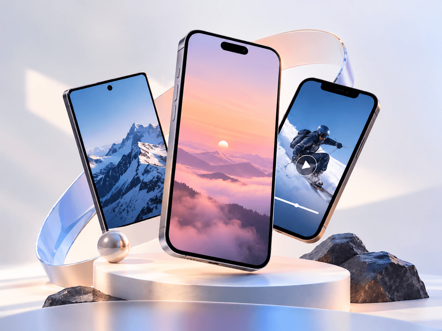
Got tired of creating a new phone mockup every time I wanted to showcase a screen 😅
So I built Phoneframe for Framer.
Just drop in your image or video, pick the phone style you want, and customize everything right inside Framer.
iPhone, Dynamic Island, notch, Android, minimal frames + control over sizing, orientation, screen fit, positioning, bezel, colors, rotation and more.
Made it for app showcases, SaaS sites, portfolios, case studies, or anywhere you want to present a mobile screen without leaving Framer.
And yep, it’s completely free.
Would love to see what you build with it :)
diff models of mobile cover added in framer component you can add video, image or any other visual in it to showcase.
what do you say? should i publish it in marketplace or not?
not every creative studio needs bright colors, some work better with cinematic views,
another hero section design 📍
pricing section of one of my upcoming Framer template
if u guys forget, i've created this X profile card.
you all can use in your templates, sites and portfolios, to make it more visual driven your social platform.
Check in my profile:)
Search looks like a pretty small feature… until you actually have to build everything around it.
So i build "quick search" component
building framer component that bothered me.
i was way to bored while using links to navigate to other platforms and profiles, but why won't we give a glimpse as how those profile looks like.
just take an example of X profile.
you creating your portfolio or any creator site where mentioning X profile with just an logo icon is way too boring way to take people from one place to aother.
i've seen most of the time, showing how your profile looks like in your project itself, shows and let viewer know what they're expecting and will see while navigating.
i just get this idea from something pretty simple: if someone visits my portfolio and wants to find me on X, i don't really love giving them nothing except an X icon.
so let's fill the space with showing profile, you recover image, profile images, bio, followers, website link or whatever you want to customize in.
basically enough context to understand who the person is before clicking away.
still experimenting with where something like this belongs in a page.
Just published a new Framer component 👀
Meet X Profile Card, a nicer way to show your X profile on your website instead of dropping another boring social icon in the footer.
It gives visitors a quick look at your profile, bio, location, website, followers + following, all inside a clean customizable card.
Made it for portfolios, personal sites, creator pages, agencies, or basically anywhere you want your X profile to feel like part of the design.
Simple to customize. Drop it in and make it yours ✦
isn't this CTA will make people click and take action?
adding urgency in taking action, increase conversion rate.
Search is easy to add, a good search experience takes a little more work.
So I built Quick Search for framer Instead of setting up results, empty states, no-result messages, hover states and styling from scratch, you can drop this in and make it yours.
Made it available for Framer, check it out on my profile component section.
spent 4 hours on this hero section design in Framer 🔫
did I cook?
Got tired of creating a new phone mockup every time I wanted to showcase a screen 😅
So I built Phoneframe for Framer.
Just drop in your image or video, pick the phone style you want, and customize everything right inside Framer.
iPhone, Dynamic Island, notch, Android, minimal frames + control over sizing, orientation, screen fit, positioning, bezel, colors, rotation and more.
Made it for app showcases, SaaS sites, portfolios, case studies, or anywhere you want to present a mobile screen without leaving Framer.
And yep, it’s completely free.
Would love to see what you build with it :)
diff models of mobile cover added in framer component you can add video, image or any other visual in it to showcase.
what do you say? should i publish it in marketplace or not?
not every creative studio needs bright colors, some work better with cinematic views,
another hero section design 📍
pricing section of one of my upcoming Framer template
if u guys forget, i've created this X profile card.
you all can use in your templates, sites and portfolios, to make it more visual driven your social platform.
Check in my profile:)
Search looks like a pretty small feature… until you actually have to build everything around it.
So i build "quick search" component
building framer component that bothered me.
i was way to bored while using links to navigate to other platforms and profiles, but why won't we give a glimpse as how those profile looks like.
just take an example of X profile.
you creating your portfolio or any creator site where mentioning X profile with just an logo icon is way too boring way to take people from one place to aother.
i've seen most of the time, showing how your profile looks like in your project itself, shows and let viewer know what they're expecting and will see while navigating.
i just get this idea from something pretty simple: if someone visits my portfolio and wants to find me on X, i don't really love giving them nothing except an X icon.
so let's fill the space with showing profile, you recover image, profile images, bio, followers, website link or whatever you want to customize in.
basically enough context to understand who the person is before clicking away.
still experimenting with where something like this belongs in a page.
Just published a new Framer component 👀
Meet X Profile Card, a nicer way to show your X profile on your website instead of dropping another boring social icon in the footer.
It gives visitors a quick look at your profile, bio, location, website, followers + following, all inside a clean customizable card.
Made it for portfolios, personal sites, creator pages, agencies, or basically anywhere you want your X profile to feel like part of the design.
Simple to customize. Drop it in and make it yours ✦
isn't this CTA will make people click and take action?
adding urgency in taking action, increase conversion rate.
Search is easy to add, a good search experience takes a little more work.
So I built Quick Search for framer Instead of setting up results, empty states, no-result messages, hover states and styling from scratch, you can drop this in and make it yours.
Made it available for Framer, check it out on my profile component section.
spent 4 hours on this hero section design in Framer 🔫
did I cook?
Got tired of creating a new phone mockup every time I wanted to showcase a screen 😅
So I built Phoneframe for Framer.
Just drop in your image or video, pick the phone style you want, and customize everything right inside Framer.
iPhone, Dynamic Island, notch, Android, minimal frames + control over sizing, orientation, screen fit, positioning, bezel, colors, rotation and more.
Made it for app showcases, SaaS sites, portfolios, case studies, or anywhere you want to present a mobile screen without leaving Framer.
And yep, it’s completely free.
Would love to see what you build with it :)
diff models of mobile cover added in framer component you can add video, image or any other visual in it to showcase.
what do you say? should i publish it in marketplace or not?
not every creative studio needs bright colors, some work better with cinematic views,
another hero section design 📍
pricing section of one of my upcoming Framer template
if u guys forget, i've created this X profile card.
you all can use in your templates, sites and portfolios, to make it more visual driven your social platform.
Check in my profile:)
Search looks like a pretty small feature… until you actually have to build everything around it.
So i build "quick search" component
building framer component that bothered me.
i was way to bored while using links to navigate to other platforms and profiles, but why won't we give a glimpse as how those profile looks like.
just take an example of X profile.
you creating your portfolio or any creator site where mentioning X profile with just an logo icon is way too boring way to take people from one place to aother.
i've seen most of the time, showing how your profile looks like in your project itself, shows and let viewer know what they're expecting and will see while navigating.
i just get this idea from something pretty simple: if someone visits my portfolio and wants to find me on X, i don't really love giving them nothing except an X icon.
so let's fill the space with showing profile, you recover image, profile images, bio, followers, website link or whatever you want to customize in.
basically enough context to understand who the person is before clicking away.
still experimenting with where something like this belongs in a page.
Just published a new Framer component 👀
Meet X Profile Card, a nicer way to show your X profile on your website instead of dropping another boring social icon in the footer.
It gives visitors a quick look at your profile, bio, location, website, followers + following, all inside a clean customizable card.
Made it for portfolios, personal sites, creator pages, agencies, or basically anywhere you want your X profile to feel like part of the design.
Simple to customize. Drop it in and make it yours ✦