


Sergei Evdokimov
Award-winning designer crafting high-converting Framer sites for SaaS & tech startups. Founder of Creative Shark Studio
Aube is out on the Framer Marketplace, and it's free.
Use it for a client, for your own product, or take it apart to see how the scroll effects work.




I reworked the color palette for my Framer template.
The beige color gave the template too much personality. It should be easy for buyers to imagine their own product in the template, so I decided to go with a more neutral color palette. In my opinion feels more practical now. What do you think?
Today I created a pricing section with a toggle for template. There will also be a separate page with a price table. Next step: the Reviews and FAQ section
Just released Mono Nav ✨
A minimal navbar that ships in both black and white, with a real mobile menu.
Made a navbar and I'm giving it away.
Mono Nav: black and white themes, primary and secondary buttons, a working mobile menu. All native Framer, editable on the canvas.
Support it and it's yours free 👇

Just published Kessel, a new Framer template built for SaaS startups.
What's inside:
- 10 fully designed pages
- A built-in CMS for your blog
- Customizable ASCII animations
- Editable pricing tables (a must for any SaaS site)
- A detailed pricing page
Below you can see how Kessel shifts across different color schemes to match your brand.
Meet Kessel — an AI analytics SaaS template.
Built for founders and product teams who need a premium, conversion-ready site from day one. Dark, ASCII-inspired design that fits data and AI perfectly.
7 core pages, CMS blog, full pricing page, and ready-to-edit demo content.


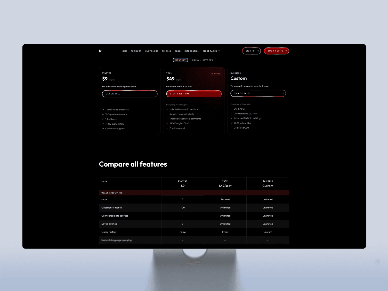
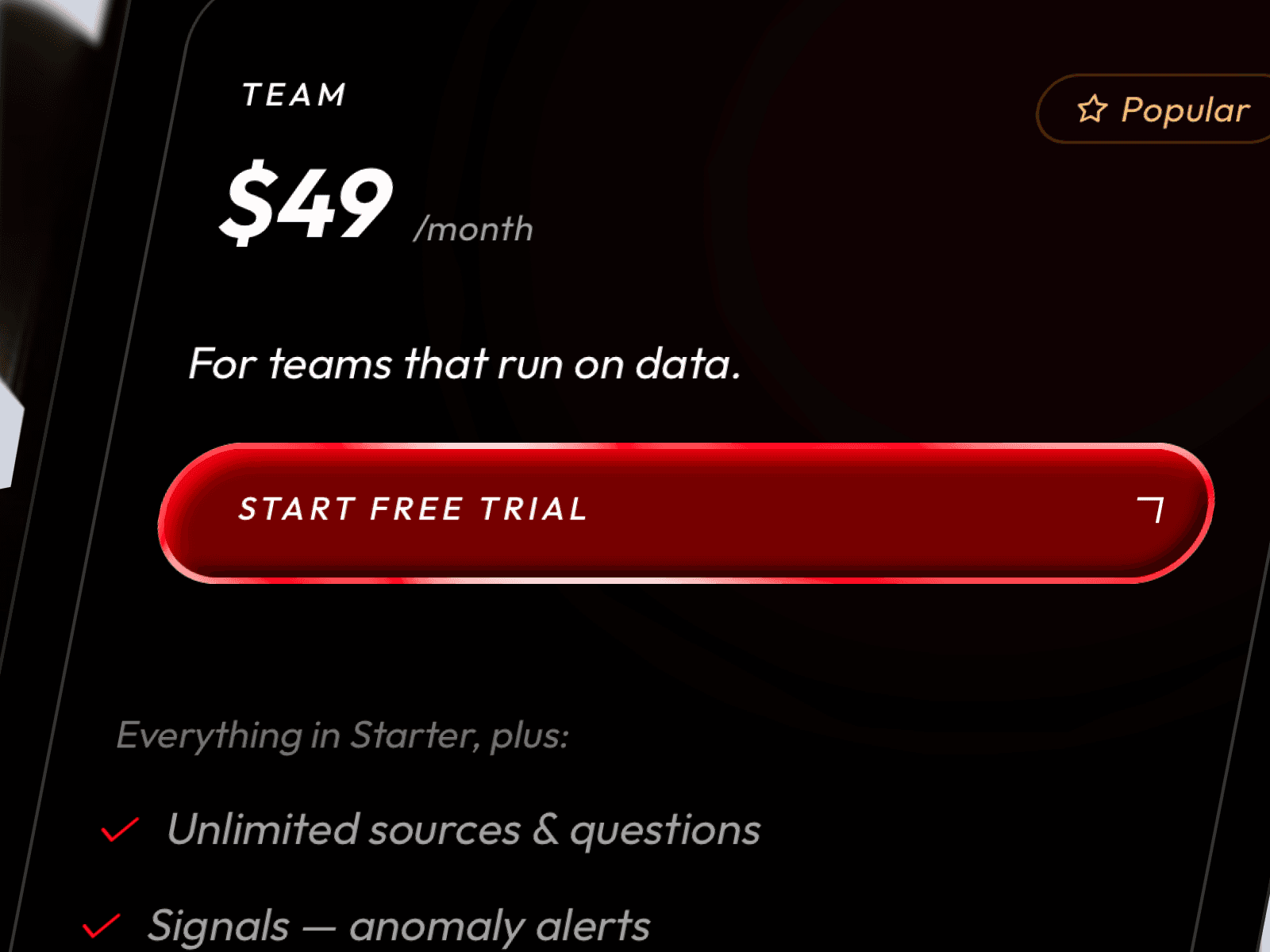
What's cooking in Kessel Framer template:
Hero ✅ Pricing ✅ Product ✅ Customers ✅ Blog and article CMS ✅
Next:
404 ⬜ Integrations ⬜ Waitlist ⬜
Kairo - Framer template for SaaS is so close now. Customers page done. Just the blog CMS and a 404 page left to build.
Then it's polish and ship.
I thought the product page for template would be the easiest one. I was wrong.
With the Hero and Pricing pages, it's all pretty clear: hook the user and make the sale. But the product page has to explain the value without turning into a boring list of features.
Here’s how it turned out
Product page for framer template is taking shape.
Going with ASCII animations and proper comparison tables. Feels right for an analytics product.
Still rough 👇
Something I do on every project: start with the hardest part, the rest comes easy after that.
Day 5 of building my SaaS template. Most of my time went into research and finding the right style - fonts, colors, the overall vibe. Once that was set, everything moved fast. One day on the Hero and Main Page, another on Pricing.
To me, Hero and Pricing do most of the work. One grabs attention, the other brings in sales. Today I worked on the pricing page. For a SaaS, a pricing table is a must.
What about you? Which pages or parts matter most in a SaaS template?


