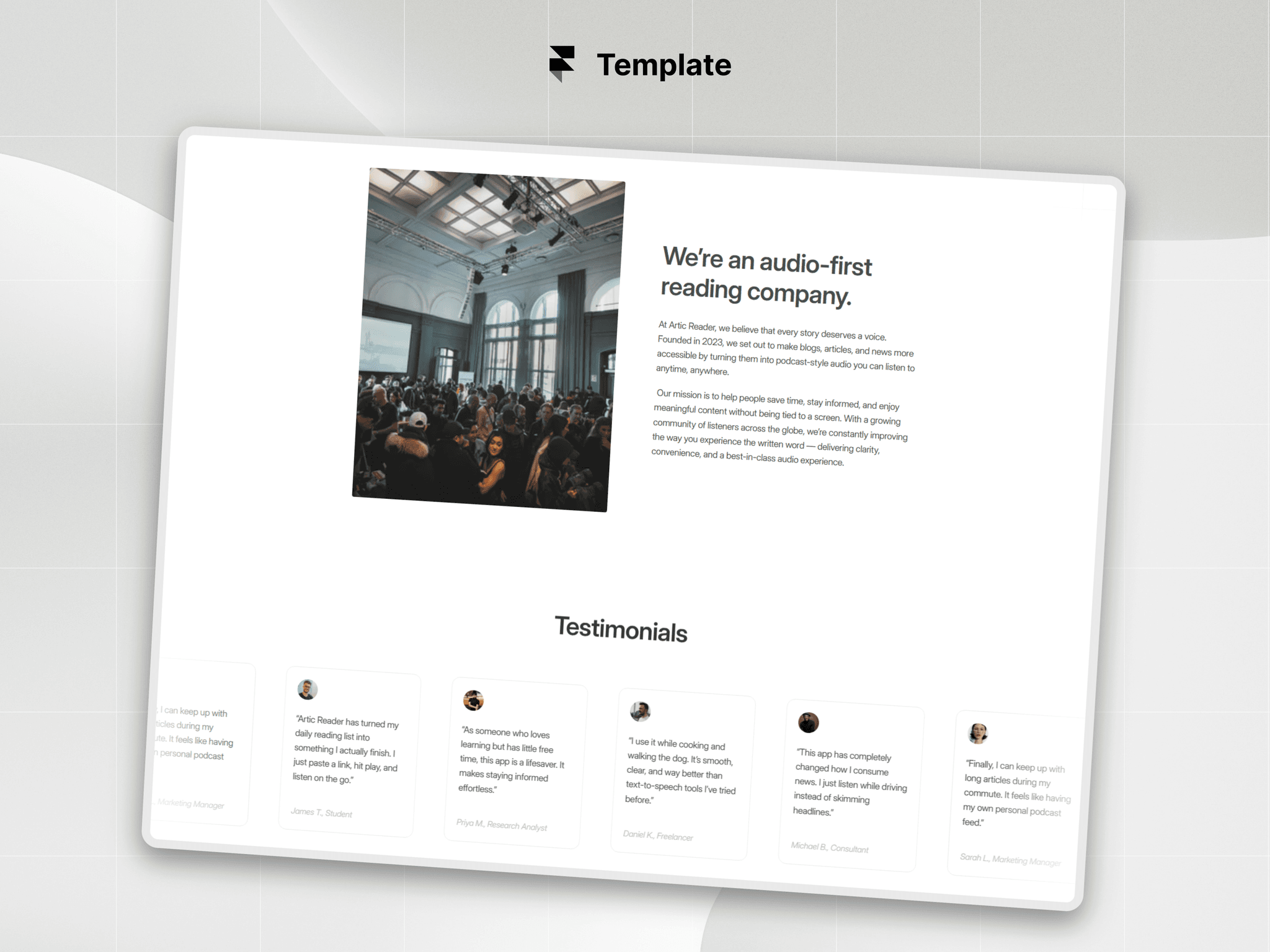
Free testimonial component!
It automatically resizes to fit quotes of any length without jumpy layout shifts, while a smooth timer advances the slides and pauses when you scroll away.

Free testimonial component!
It automatically resizes to fit quotes of any length without jumpy layout shifts, while a smooth timer advances the slides and pauses when you scroll away.
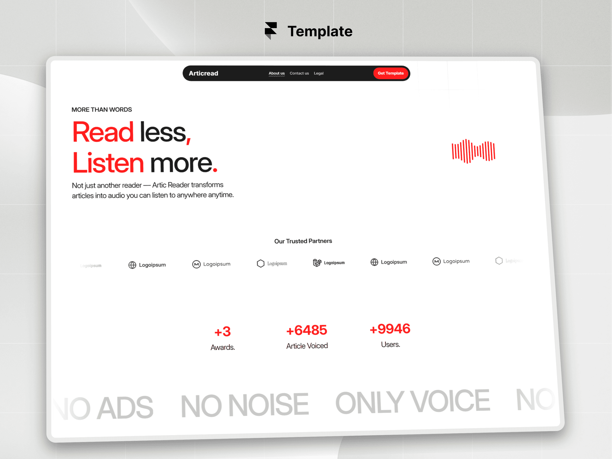
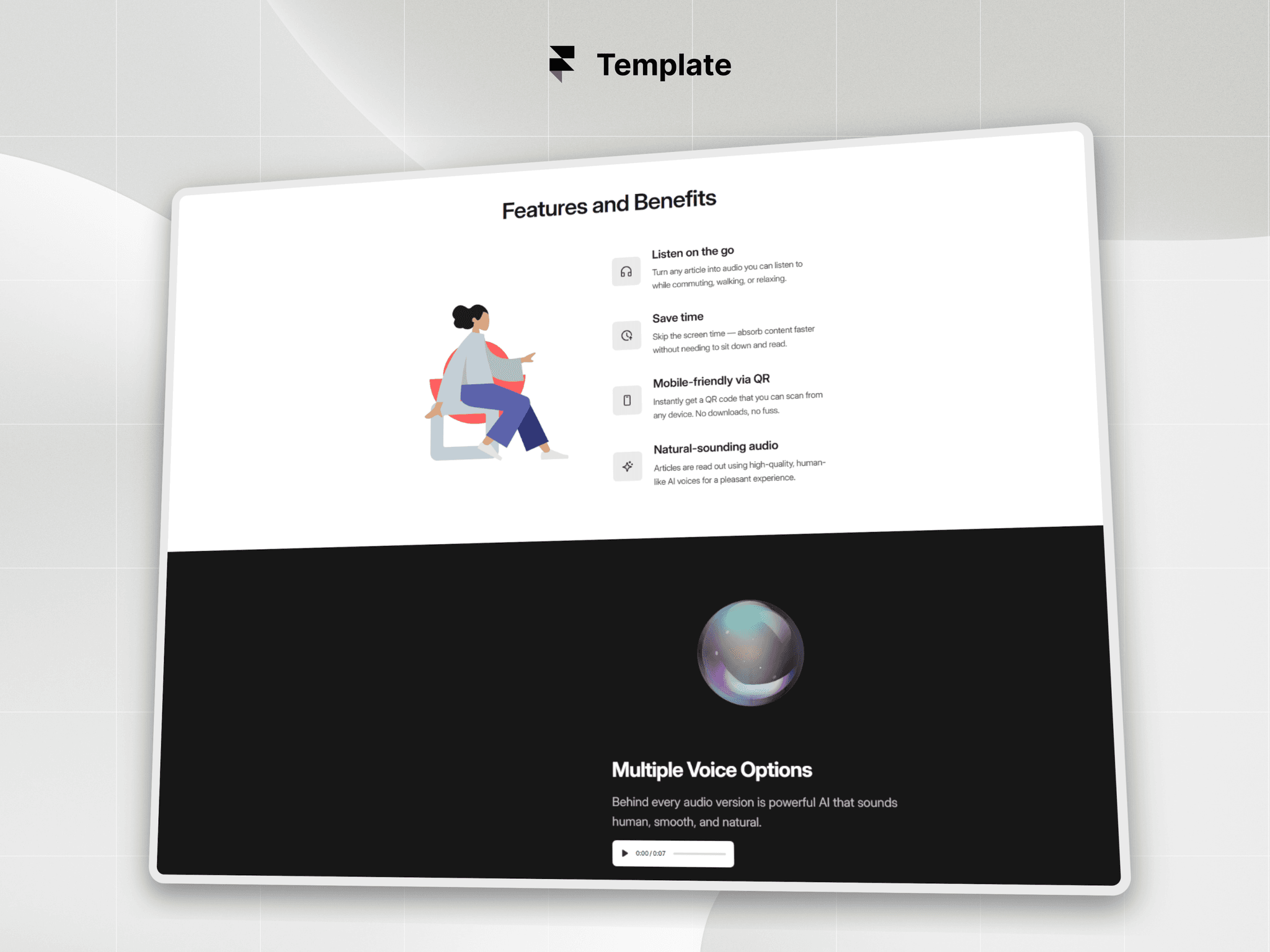
Articread is now FREE with all the premium components inside,
$20 worth of components in $9 template.
EclipseAura
A custom planet for your website.
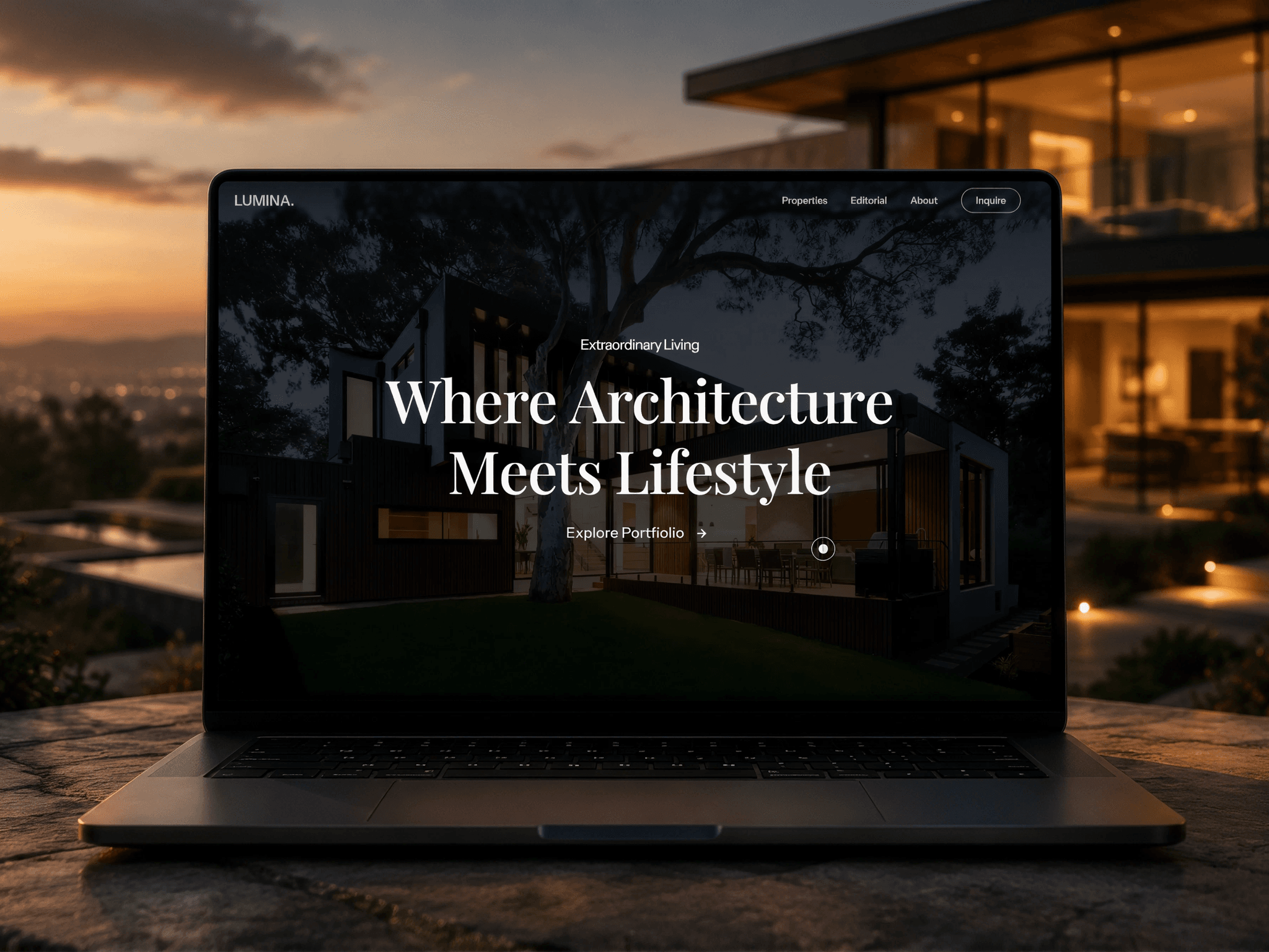
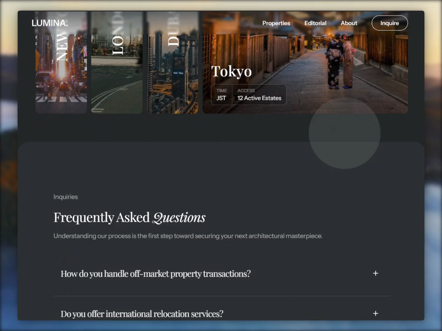
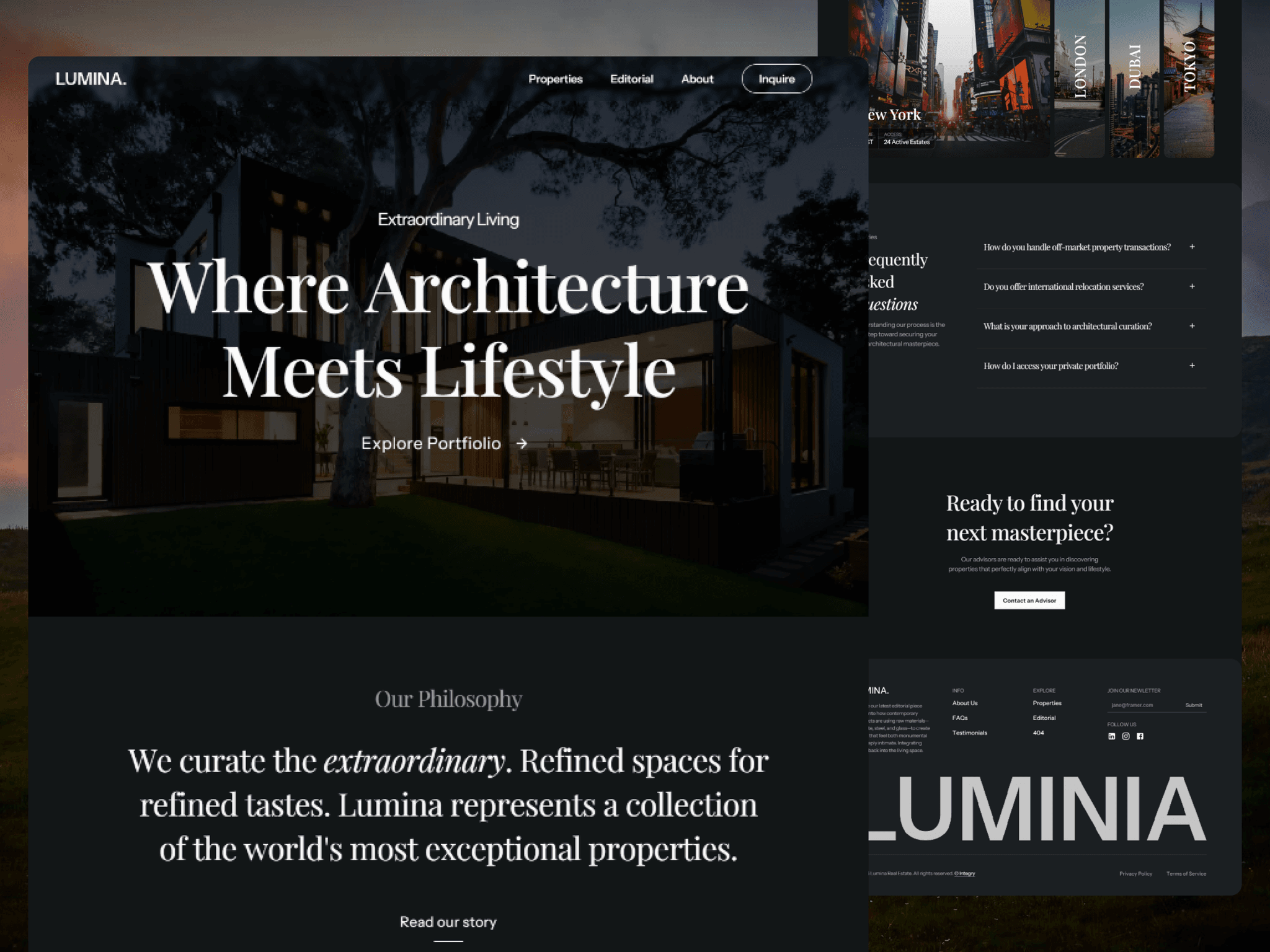
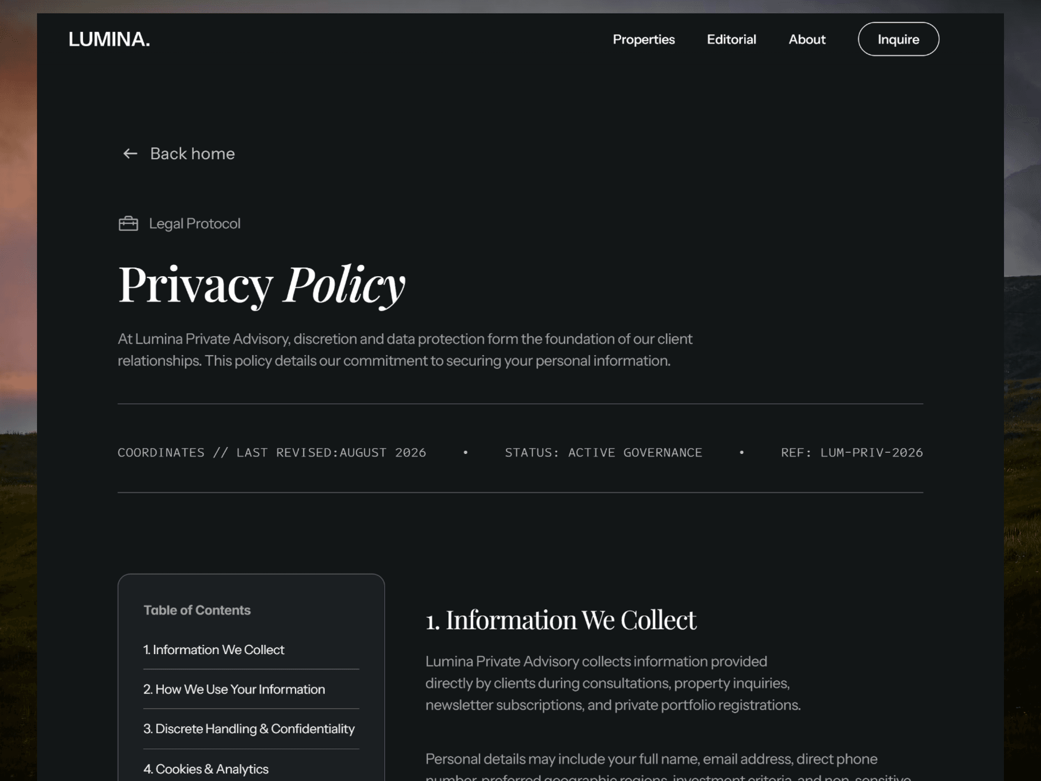
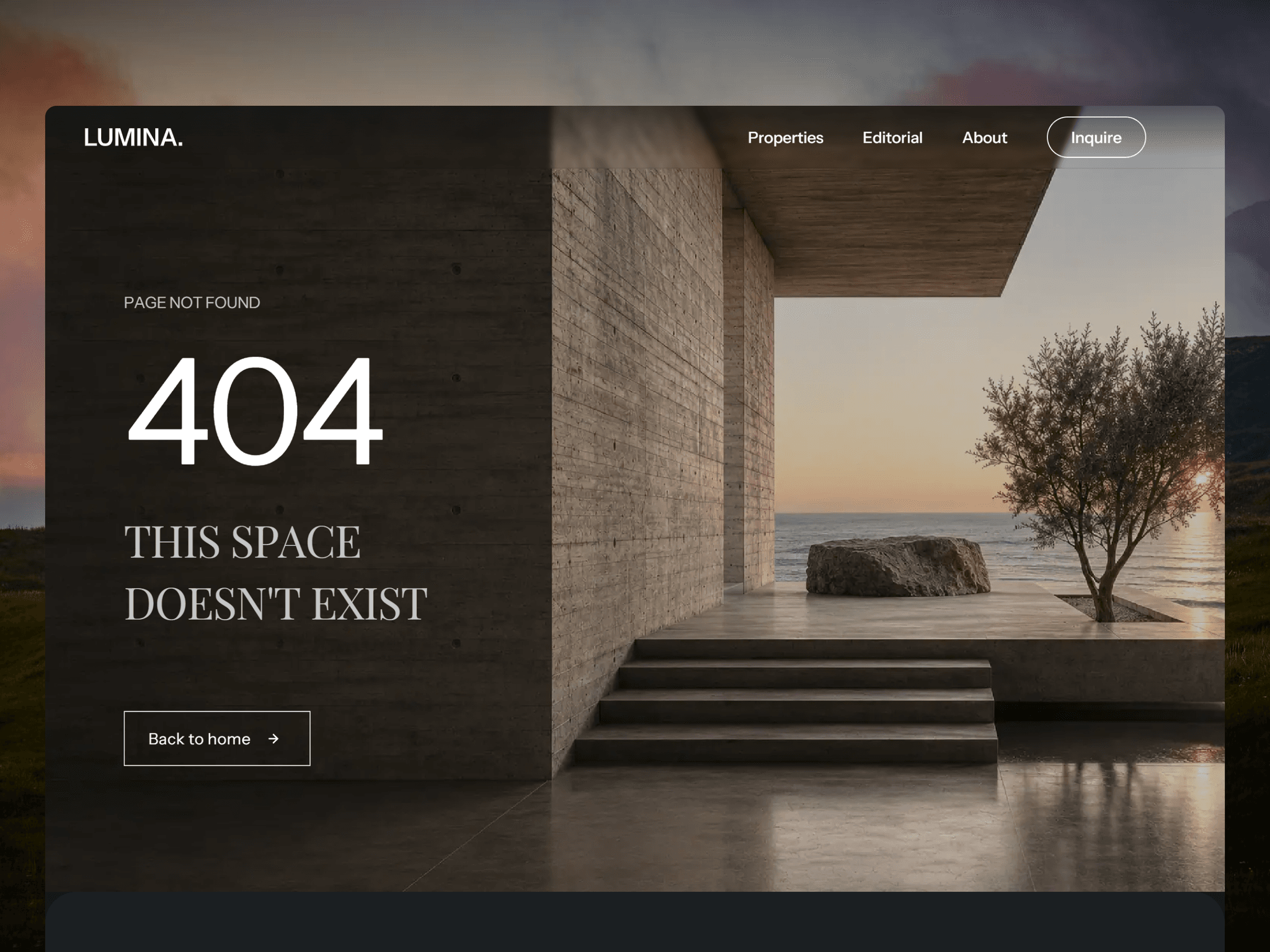
Introducing Lumina — a luxury real estate Framer template built for brokerages, boutique agencies, and architectural curators.
Editorial, high-fashion design. CMS-powered properties & blog. Global offices ticker, testimonials, FAQ, and more — fully responsive.
Premium Circle Cursor — Update Notes
Hover detection now works on all clickable elements, including Framer-linked objects, CMS cards, and any element with a pointer cursor — not just buttons and links
Click feedback added — the ring compresses on mouse down and a ripple pulse radiates outward on click
Dot visibility is now independently controllable — toggle it on/off and choose whether it shows or hides while hovering
Ring opacity is now a separate control from color
Blend mode added — Normal, Difference, and Exclusion. Difference is the standout option, automatically inverting the cursor color against any background so it's always visible
Auto-hides on touch devices so it doesn't interfere with mobile
Hide on Leave toggle controls whether the cursor disappears when the mouse exits the browser window
Performance fix — no animations or effects run inside the Framer editor, preventing canvas slowdown and export artifacts
This feels like a serious downgrade. After asking to bring the search to the front, it was updated, but changed again to this.
This adds one extra step to the navigation, I hope this will be reverted soon.
Was this done intentionally? (Spacing)
Also, non-selective text.
I was supposed to be testing the component and instead, I spent 10 minutes trying to beat my high score.
That's exactly why I built DX Grid—to give visitors something unexpected that makes them stick around a little longer. To be completely honest, it works wonderfully.
I often get stuck on this while visiting my own website. Give it a try and let me know your thoughts!
A few days ago, I was showing Framer to a client. He was trying to find templates and components for his project, and every time he needed something, he'd Google it — then click through to find what he was looking for. He wasn't using Framer's built-in search at all.
That's when I realised he couldn't find search, and it had actually happened to me too when Framer 3.0 launched.
I think making the search more visible and front-and-center would make a real difference — especially for non-technical users who are still getting familiar with the platform. A small UX change like this could go a long way in turning curious visitors into potential customers.
Here's a mockup of the search added. Would love to know your thoughts on this!
Here's a new one!
Drop it into any section, tweak a few controls, and you're good to go. 🌊
Highly optimized, no lag or performance hit.
Has the option to add images and YouTube videos to the product description been completely removed, or am I missing something?
Free testimonial component!
It automatically resizes to fit quotes of any length without jumpy layout shifts, while a smooth timer advances the slides and pauses when you scroll away.
Articread is now FREE with all the premium components inside,
$20 worth of components in $9 template.
EclipseAura
A custom planet for your website.
Introducing Lumina — a luxury real estate Framer template built for brokerages, boutique agencies, and architectural curators.
Editorial, high-fashion design. CMS-powered properties & blog. Global offices ticker, testimonials, FAQ, and more — fully responsive.
Premium Circle Cursor — Update Notes
Hover detection now works on all clickable elements, including Framer-linked objects, CMS cards, and any element with a pointer cursor — not just buttons and links
Click feedback added — the ring compresses on mouse down and a ripple pulse radiates outward on click
Dot visibility is now independently controllable — toggle it on/off and choose whether it shows or hides while hovering
Ring opacity is now a separate control from color
Blend mode added — Normal, Difference, and Exclusion. Difference is the standout option, automatically inverting the cursor color against any background so it's always visible
Auto-hides on touch devices so it doesn't interfere with mobile
Hide on Leave toggle controls whether the cursor disappears when the mouse exits the browser window
Performance fix — no animations or effects run inside the Framer editor, preventing canvas slowdown and export artifacts
This feels like a serious downgrade. After asking to bring the search to the front, it was updated, but changed again to this.
This adds one extra step to the navigation, I hope this will be reverted soon.
Was this done intentionally? (Spacing)
Also, non-selective text.
I was supposed to be testing the component and instead, I spent 10 minutes trying to beat my high score.
That's exactly why I built DX Grid—to give visitors something unexpected that makes them stick around a little longer. To be completely honest, it works wonderfully.
I often get stuck on this while visiting my own website. Give it a try and let me know your thoughts!
A few days ago, I was showing Framer to a client. He was trying to find templates and components for his project, and every time he needed something, he'd Google it — then click through to find what he was looking for. He wasn't using Framer's built-in search at all.
That's when I realised he couldn't find search, and it had actually happened to me too when Framer 3.0 launched.
I think making the search more visible and front-and-center would make a real difference — especially for non-technical users who are still getting familiar with the platform. A small UX change like this could go a long way in turning curious visitors into potential customers.
Here's a mockup of the search added. Would love to know your thoughts on this!
Here's a new one!
Drop it into any section, tweak a few controls, and you're good to go. 🌊
Highly optimized, no lag or performance hit.
Has the option to add images and YouTube videos to the product description been completely removed, or am I missing something?
Free testimonial component!
It automatically resizes to fit quotes of any length without jumpy layout shifts, while a smooth timer advances the slides and pauses when you scroll away.
Articread is now FREE with all the premium components inside,
$20 worth of components in $9 template.
EclipseAura
A custom planet for your website.
Introducing Lumina — a luxury real estate Framer template built for brokerages, boutique agencies, and architectural curators.
Editorial, high-fashion design. CMS-powered properties & blog. Global offices ticker, testimonials, FAQ, and more — fully responsive.
Premium Circle Cursor — Update Notes
Hover detection now works on all clickable elements, including Framer-linked objects, CMS cards, and any element with a pointer cursor — not just buttons and links
Click feedback added — the ring compresses on mouse down and a ripple pulse radiates outward on click
Dot visibility is now independently controllable — toggle it on/off and choose whether it shows or hides while hovering
Ring opacity is now a separate control from color
Blend mode added — Normal, Difference, and Exclusion. Difference is the standout option, automatically inverting the cursor color against any background so it's always visible
Auto-hides on touch devices so it doesn't interfere with mobile
Hide on Leave toggle controls whether the cursor disappears when the mouse exits the browser window
Performance fix — no animations or effects run inside the Framer editor, preventing canvas slowdown and export artifacts
This feels like a serious downgrade. After asking to bring the search to the front, it was updated, but changed again to this.
This adds one extra step to the navigation, I hope this will be reverted soon.
Was this done intentionally? (Spacing)
Also, non-selective text.
I was supposed to be testing the component and instead, I spent 10 minutes trying to beat my high score.
That's exactly why I built DX Grid—to give visitors something unexpected that makes them stick around a little longer. To be completely honest, it works wonderfully.
I often get stuck on this while visiting my own website. Give it a try and let me know your thoughts!
A few days ago, I was showing Framer to a client. He was trying to find templates and components for his project, and every time he needed something, he'd Google it — then click through to find what he was looking for. He wasn't using Framer's built-in search at all.
That's when I realised he couldn't find search, and it had actually happened to me too when Framer 3.0 launched.
I think making the search more visible and front-and-center would make a real difference — especially for non-technical users who are still getting familiar with the platform. A small UX change like this could go a long way in turning curious visitors into potential customers.
Here's a mockup of the search added. Would love to know your thoughts on this!
Here's a new one!
Drop it into any section, tweak a few controls, and you're good to go. 🌊
Highly optimized, no lag or performance hit.
Has the option to add images and YouTube videos to the product description been completely removed, or am I missing something?