Framevia | The Visual Pratik

Framevia | The Visual Pratik

Crafting premium Framer templates and high-converting websites with bold design, clean interactions, and exceptional user experience.

Creator3 Listings
Framevia | The Visual Pratik
Framevia | The Visual Pratik12h

💡 Design Pattern Tip: How to use Hotkey CTA with plain inputs

For everyone duplicate-remixing the component pack into their AI or SaaS landing pages today, here is a quick structural layout tip for maximizing conversion depth:

If you are pairing these hotkey buttons alongside a primary email newsletter form or an active global search wrapper bar, use the exposed canvas properties to toggle the secondary "Book a Demo" glass state to display [ ⌘ K ] or [ Ctrl K ].

This gives users an immediate visual cue that your platform runs on keyboard-driven commands, making your web layouts feel like a premium, production-ready software web app out of the box.

📥 Install Component Directly:

🔗 https://framevia.lemonsqueezy.com/checkout/buy/cc01cb06-7261-47c8-91de-084545979600

👀 Test the tactile physics live:

🔗 https://hotkey-cta.framer.website/

Framevia | The Visual Pratik
Framevia | The Visual Pratikin Marketplace·1d

Hey Framer community 👋

Meet Hotkey CTA: a premium call-to-action button with a built-in keycap hint. Two variants, Primary and Secondary, each with polished hover and pressed states, built entirely from native Framer layers. No code.

WHY IT'S DIFFERENT

Most CTA buttons look the same. This one borrows a detail from modern software interfaces: a small keycap that lifts on hover and presses down on click. It makes your button feel like part of a real product.

WHAT'S INSIDE

- Primary and Secondary variants

- Hover and pressed states on both

- Gold glow, plus a keycap that lifts and presses

- Editable label and key text (↵, ⌘K, Ctrl K, or a short badge)

- A switch to hide the key for a plain button

- Color and text styles included

GOOD TO KNOW

The keycap is a visual hint. For a working keyboard shortcut, pair it with a shortcut component such as Key Master.

Perfect for SaaS, AI and developer-tool sites: hero sections, pricing tables and sign-up forms.

GET IT

👉 Checkout: https://framevia.lemonsqueezy.com/checkout/buy/cc01cb06-7261-47c8-91de-084545979600

👀 Live preview: https://hotkey-cta.framer.website/

I'd love your feedback: what key or label would you put in the keycap? Tell me below!

Built by Framevia | The Visual Pratik.

Framevia | The Visual Pratik
Framevia | The Visual Pratikin Marketplace·2d

Aura Button: a premium native CTA component (Primary + Secondary)

Hey Framer community! 👋

I just submitted Aura Button to the Marketplace: a premium CTA button built entirely from native Framer layers. No code, no overrides.

WHY I BUILT IT

Many button components are code-based, which means you can't click into them. I wanted real polish that you can still edit like any other layer.

WHAT'S INSIDE

- Primary and Secondary variants

- Hover and pressed states on both

- Gold glow, label roll and arrow rotation, plus a soft sheen on the Primary

- Editable label text from the properties panel

- Color and text styles included

- Sizes itself to its label, so any text length works

TRY IT LIVE 👉 https://aura-button.framer.website/

Hover over both buttons to see every state.

Great for hero sections, pricing tables, product pages and forms.

I'D LOVE YOUR FEEDBACK

1. Do the hover animations feel smooth, or too quick?

2. What should come next: more sizes, an icon-only version, or new color themes?

Tell me what you think below, and I'll take it into account for future updates.

🚀 Get Instant Remix Access: https://framevia.lemonsqueezy.com/checkout/buy/8bf1b2cb-07c7-4935-8f4a-1e8e61dc3215

Framevia | The Visual Pratik

Framevia | The Visual Pratik
Framevia | The Visual Pratik2d

5 Days Left for the Iron Core Launch Discount

Hey Framer Community! 🏋️‍♂️🕒

Just a fast mid-week countdown alert for freelance web designers and digital studio owners: our honest 10-day creator launch special for Iron Core is officially crossing its halfway mark today!

From now until Saturday, October 10th, checkout coupon code IRON49 remains fully operational inside the gateway backend, dropping the price of the complete 13-page, motion-engineered static fitness template from $59 down to $49.

If you have a boutique gym storefront layout, high-end performance studio client, or an elite trainer portfolio build lined up on your project pipeline for this month, you can lock in a premium, production-ready system right now while saving on your asset margins.

⚡ The Architecture Checklist:

• Clean Static System: 100% front-end layout with zero database or CMS layer maintenance bloat. Max local SEO speed out of the box.

• Premium Interactive Details: Features lightweight animated numerical counters, responsive visual timelines, and an exclusive desktop Fixed Footer Reveal animation pattern.

• Ready to Ship: Breakpoint scaling, form layout inputs, and typography fully polished across all responsive viewports.

Once the clock hits October 10th, the discount script turns off permanently. You can test the interaction physics and check out the fluid layouts completely live on the staging canvas:

🔗 Live Interactive Canvas: iron-core.framer.website/

Check Out 👉 https://framevia.lemonsqueezy.com/checkout/buy/d3aa122b-f239-418f-b401-0311174a3e59

Appreciate the phenomenal support on this debut theme so far! 👊🔥

Iron Core — Premium Gym & Fitness Framer Template
framevia.lemonsqueezy.com · Build a stronger fitness brand …
Framevia | The Visual Pratik
Framevia | The Visual Pratik4d

Tip: 3-Layer Animated Proximity Gradient Glows

Hey Framer Community! ⚡🎨

Wanted to drop a quick layout blueprint to help other creators build an ultra-premium, interactive Proximity Gradient Glow Button completely native inside the canvas—without writing custom code or bloating your layers weight.

The secret to keeping animated neon text fully accessible and readable is a strict 3-layer depth matrix inside a single component wrapper.

⚡ The Master Structural Setup:

• 1. The Wrapper Frame: Set to your standard pill dimensions (e.g., 220px × 56px) with a 99px corner radius. Set the background color to a deep charcoal or dark blue (#0B1426) at 85% opacity, and add a 1px border gradient set to 15% opacity to trap the glass edge cleanly.

• 2. The Liquid Background Core: Draw a frame inside, scaled to 100% width and height. Set its Z-Index to 1. Apply a vibrant 3-stop linear gradient (e.g., Electric Cyan to Neon Sky Blue) at a 45° angle. Add a Loop Effect set to Rotate (360° over 4s on a Linear curve), and add a 12px Layer Blur graphic effect. This creates a moving liquid-aurora flow perfectly contained by the wrapper clip.

• 3. The Top Typography Layer: Place your text block directly over the center, and set its Z-Index strictly to 2 to pin it safely above the shifting gradient backgrounds.

🚀 Tuning Interactive Micro-Animations:

• Hover State: Add a variant layer and apply a soft outer Shadow Graphic Effect matching your primary neon hex tone. Set the blur to 24px and the spread to 2px. The button will immediately cast an ambient glow onto the canvas the exact millisecond the cursor approaches.

• Pressed State: Add a final variant with a global layout scale modification property set uniformly to 0.96 to give the user a tactile, responsive click physical response when tapped.

Would love to hear how you guys handle your high-conversion CTAs—do you prefer clean, solid-color interactive states or custom animated aura wrappers for your premium builds? 👇

Framevia | The Visual Pratik
Framevia | The Visual Pratik4d

Hey Framer Community! 💎

To kick off the weekend browsing sessions, I wanted to drop a curated visual breakdown of 5 premium Dark UI design layout patterns that instantly elevate standard websites into luxury-grade digital experiences.

When building premium themes or pitching high-ticket clients, achieving a clean, sophisticated dark mode requires balancing subtle visual depth rather than just tossing text onto a solid pitch-black #000000 background canvas.

⚡ 5 Core Dark UI Layout Rules to Implement:

• 1. Strict Layered Elevations: Use deep navy or dark slate backgrounds (#0B1526 / #0F172A) as your absolute baseline frame. Elevate your active cards and inner layout rows using slightly lighter hex values (#1E293B) to create natural visual depth.

• 2. Controlled Glassmorphic Borders: Instead of using harsh solid border strokes, utilize a 1px frame border with a dual-color linear gradient set to low transparency (10%–15% opacity). Pair this with a deep backdrop blur to create a premium glass look.

• 3. High-Contrast Focus CTAs: Keep 95% of your typography layout elements restricted to crisp white and muted greys, then isolate your primary action buttons using a single, intense energetic color burst (like neon cyan or rich crimson red).

• 4. Expansive Asymmetric Grid Spacing: Luxury web design is defined by whitespace. Increase your section paddings to 140px–160px on desktop to give large typography headings room to breathe.

• 5. Custom Staging Interactivity: Build lightweight, interactive timeline micro-animations or custom scroll reveals to reward users as they explore down the page columns.

Would love to hear your thoughts—do you prefer shipping clean, minimal deep blue/grey layouts, or do you always go for absolute pitch-black backdrops for your premium client builds? Drop your favorite setups below! 👇

Framevia | The Visual Pratik
Framevia | The Visual Pratik5d

Iron Core — 13-Page Fitness Dark UI System

Hey Framer Community! 🏋️‍♂️

Huge milestone update to close out the week! Thanks to the incredible feedback and design interactions from other creators over our launch, Iron Core has officially pushed past the 91 unique high-retention visitor pool milestone with over 224 total page views today!

The response to our clean motion details and performance optimization has been spectacular.

To celebrate our launch week traffic momentum, our honest 10-day creator special is officially active in the gateway backend. From now until October 10th, you can use the coupon code IRON49 at checkout to grab the full 13-page, zero-CMS static template system for $49 instead of $59.

⚡ Core Architecture Review:

• Clean Static System: 100% front-end layout with zero database or CMS layer maintenance bloat. Max local SEO speed out of the box.

• Premium Interactive Details: Features lightweight animated numerical counters, responsive visual timelines, and an exclusive desktop Fixed Footer Reveal animation pattern.

• Ready to Ship: Breakpoint scaling, form layout inputs, and typography fully polished across all responsive viewports.

If you have a boutique gym storefront, performance studio client, or an elite trainer portfolio build lined up for this month, you can check out the animations and fluid layout structure live on the staging canvas:

🔗 Live Interactive Canvas: https://iron-core.framer.website/

Appreciate the support from this group so far! 👊🔥

Framevia | The Visual Pratik
Framevia | The Visual Pratik5d

Iron Core — 13-Page Fitness Dark UI System

Hey Framer Community! 🏋️‍♂️

Huge milestone update to close out the week! Thanks to the incredible feedback and interactions from other creators over our launch, Iron Core has officially pushed past the 89 unique high-retention visitor pool milestone today!

The response to our clean motion details and performance optimization has been spectacular.

To celebrate our launch week traffic momentum, our honest 10-day creator special is officially active in the gateway backend. From now until October 10th, you can use the coupon code IRON49 at checkout to grab the full 13-page, zero-CMS static template system for $49 instead of $59 [context].

⚡ Core Architecture Review:

• Clean Static System: 100% front-end layout with zero database or CMS layer maintenance bloat. Max local SEO speed out of the box.

• Premium Interactive Details: Features lightweight animated numerical counters, responsive visual timelines, and an exclusive desktop Fixed Footer Reveal animation pattern.

• Ready to Ship: Breakpoint scaling, form layout inputs, and typography fully polished across all responsive viewports.

If you have a boutique gym storefront, performance studio client, or an elite trainer portfolio build lined up for this month, you can check out the animations and fluid layout structure live on the staging canvas:

🔗 Live Interactive Canvas: iron-core.framer.website/

Appreciate the support from this group so far! 👊🔥

Iron Core | Premium Gym & Fitness Training
iron-core.framer.website · Build your strongest body with e…
Framevia | The Visual Pratik
Framevia | The Visual Pratik5d

Backdrop Blur (Glassmorphism) Breaking in Browser Preview When Navigation Is Turned Into a Layout Template

Hey guys! 👋

I have built a custom responsive navigation component inside Framer. Visually, it looks beautiful on the canvas—it uses a dual-color gradient with transparency and a 24px Backdrop Blur to create a premium glassmorphic effect.

Everything works perfectly on a standalone frame. However, the second I turn this navigation component into a "Layout Template" (to ensure persistent, seamless animation transitions across different page routes), the Backdrop Blur completely breaks in the browser preview mode and live site.

The dual-color gradient and transparency are rendering correctly, but the 24px background blur effect completely drops out as elements scroll underneath the bar.

It seems like turning the navigation frame into a Layout Template introduces an automatic parent container or motion wrapper that breaks the backdrop-filter rendering context in the browser.

Has anyone encountered this specific bug when converting a glass nav bar into a Layout Template? Are there any specific frame layer overrides or code snippets I can apply to make sure the browser preserves the backdrop blur during persistent transitions?

Would appreciate any tips or engineering workarounds to fix this drop! Thank you! 🛠️🎨

Framevia | The Visual Pratik
Framevia | The Visual Pratik6d

Iron Core — Top 14 Fitness Theme Launch ($49)

Hey Framer Community! 🏋️‍♂️

Huge milestone update to kick off October! Thanks to your incredible design feedback and interactions over our first week, Iron Core has officially broken deep into the Top 14 (#14) Fitness themes globally on the marketplace!

To celebrate our entry into the Top 15 rows, our 10-day launch celebration discount is officially LIVE starting today.

From now until October 10th, you can use the coupon code IRON49 at checkout to grab the full 13-page, motion-engineered static system for $49 instead of $59.

⚡ Why Iron Core?

• Clean Static Architecture: 100% front-end layout with zero database or CMS layer maintenance bloat.

• Custom Motion Details: Integrated .tsx modules and an exclusive desktop Fixed Footer Reveal animation pattern.

• Pure Speed: Stripped of backend weight to preserve maximum local SEO performance out of the box.

If you have a boutique gym client, performance studio storefront, or an elite personal trainer portfolio project lined up for this month, you can test out the fluid breakpoint responsive scaling live on the staging canvas:

🔗 Live Interactive Canvas:

Iron Core | Premium Gym & Fitness Training
iron-core.framer.website · Build your strongest body with e…
Framevia | The Visual Pratik
Framevia | The Visual Pratik1w

Alert: Iron Core 10-Day Launch Special Starts Oct 1

Hey Framer Community! 🏋️‍♂️

To celebrate Iron Core entering the Top 20 Fitness layouts globally this week, I am launching an honest, limited-time 10-day price special for the community.

Starting tomorrow, October 1st at 00:00 UTC through October 10th at 00:00 UTC, you can grab the full 13-page premium dark UI ecosystem for $49 instead of $59 using the coupon code IRON49 at checkout.

I wanted to drop this early alert so anyone who has been evaluating the layout templates, testing the responsive breakpoints, or reviewing the custom .tsx modules can get ready to lock in the special rate the second it goes live automatically tonight!

🔗 Live Staging Preview:

Iron Core | Premium Gym & Fitness Training
iron-core.framer.website · Build your strongest body with e…
Framevia | The Visual Pratik
Framevia | The Visual Pratik1w

Iron Core — High-End Motion Architecture

Hey Framer Community! 🏋️‍♂️

Wanted to share a deep-dive look into the custom motion design and component architecture running inside my 13-page premium ecosystem, Iron Core.

Instead of building heavy layout loops, I focused on high-end interactive details engineered to look expensive while keeping code completely clean and static:

⚡ Key Interactive Highlights:

• Desktop-Exclusive Fixed Footer Reveal: Smooth native scroll overlay logic built strictly without complex database layers.

• 4 Custom .tsx Modules: Lightweight animated numerical counters, visual timelines, and active checks fully responsive out of the box.

• Zero Maintenance Architecture: 100% static front-end structure ensuring elite local SEO loading speeds with zero CMS plugin overhead.

I've attached a static mockup grid card below showing the layered typography layout structure. Test the fluid animations and check the breakpoint layout scaling live on the interactive canvas!

🔗 Live Interactive Canvas: https://iron-core.framer.website/

Framevia | The Visual Pratik
Framevia | The Visual Pratik1w

Hey Framer Community! 🏋️‍♂️

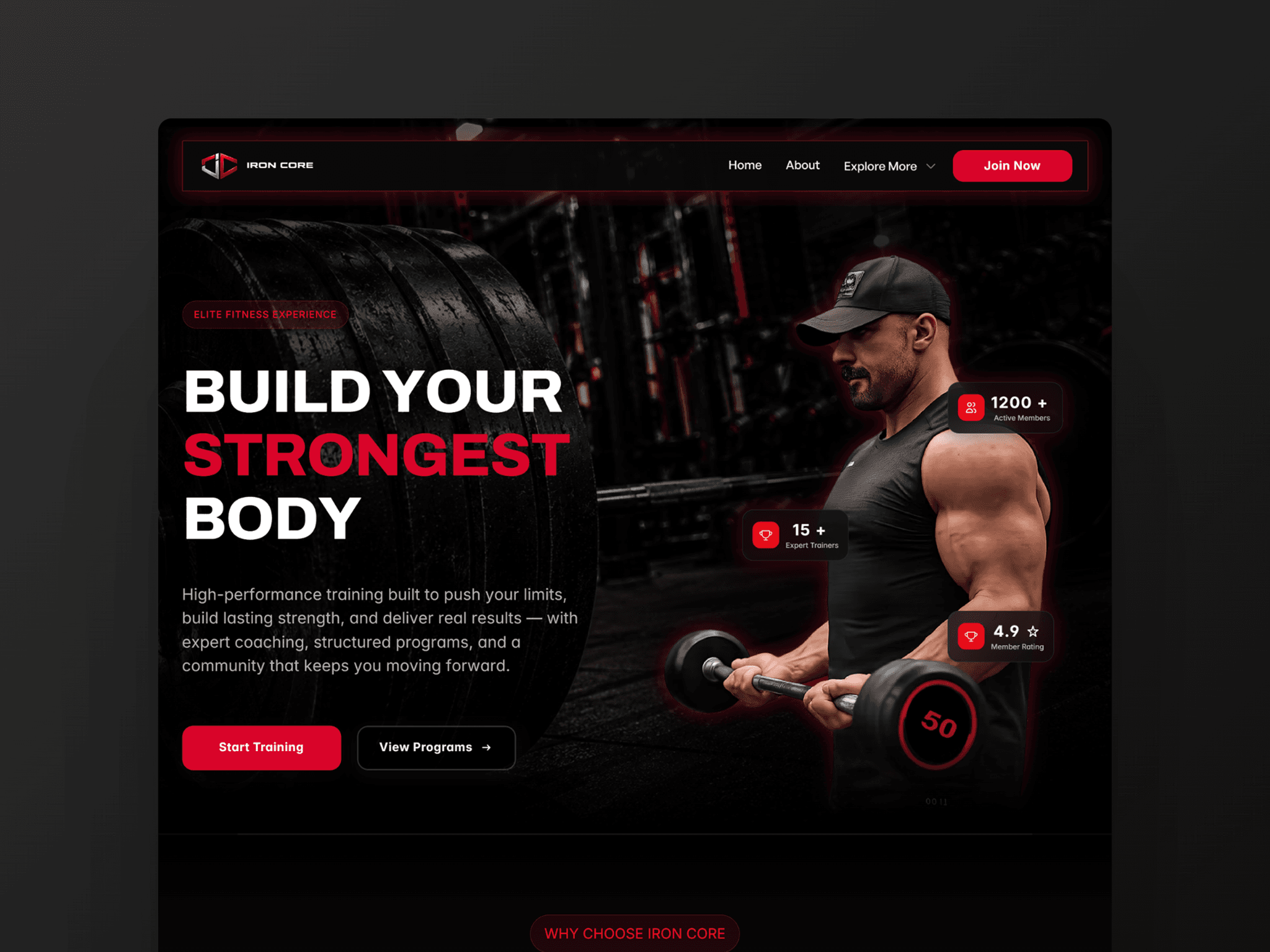
Just wrapped up a new 13-page design asset called Iron Core, engineered for premium fitness brands, elite personal trainers, and performance studios looking for a bold, high-contrast digital presence.

To maximize local SEO layout speeds and eliminate database overhead, this theme is intentionally built completely clean as a pure static front-end with zero database or CMS layers. Less layout weight, zero client maintenance bloat.

✨ Key UI Highlights:

• Aggressive, premium dark aesthetic with strong typography hierarchy

• Fixed Footer Reveal animation pattern (test it live on desktop!)

• 4 custom .tsx code modules fully integrated (counters, timelines, checks)

• Universal form routing mapped entirely on the front end

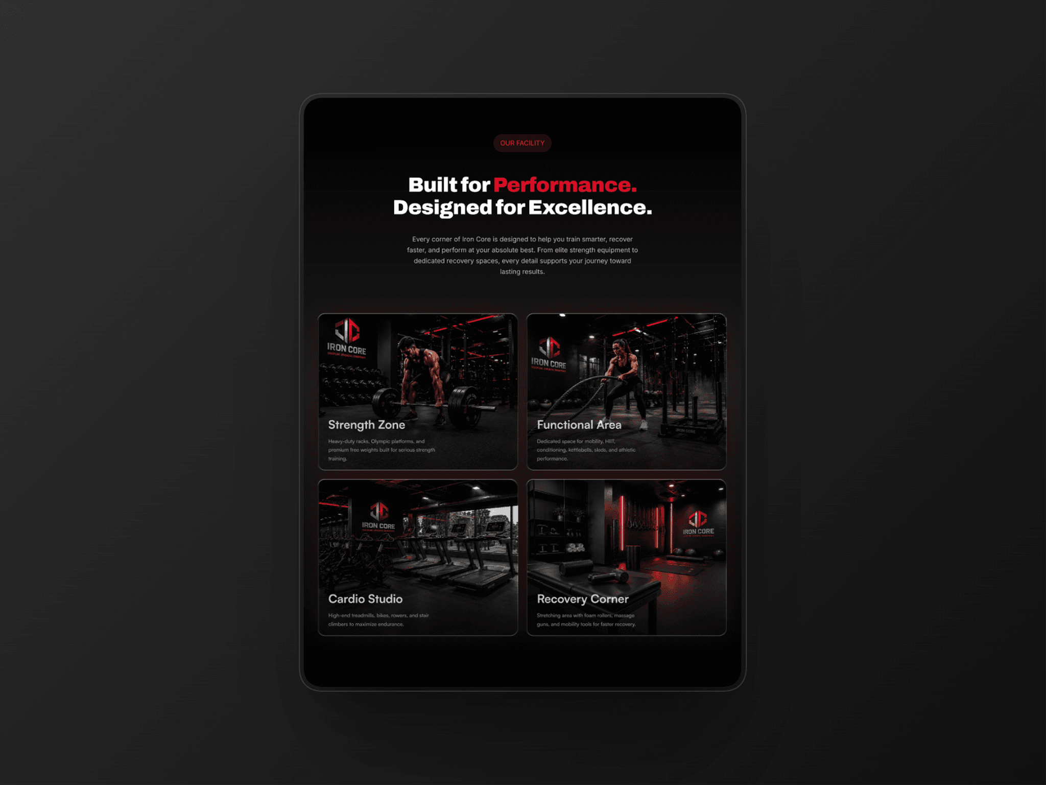
I’ve attached a few static mockup cards below showing off the grid layouts and component structures. I’d love to hear your thoughts on the typography layout design and responsive spacing!

🔗 Live Staging Preview: https://iron-core.framer.website/

Framevia | The Visual Pratik
Framevia | The Visual Pratik1w

Trending: Iron Core — Premium 13-Page Gym & Fitness Website Framework 🚀🏋️‍♂️

Hey community! Thrilled to share that Iron Core has officially broken into the Top 25 Trending Fitness templates on the marketplace!

Engineered exclusively for high-end fitness brands, performance studios, and personal trainers, this 13-page ecosystem bridges the gap between cinematic dark aesthetics and high-performance frontend engineering.

🛠️ What’s packed inside the foundation:

• Cinematic Engineering: Custom Code Override powering a unique, one-time page loading entrance animation, paired with a modern desktop Fixed Footer Reveal.

• 4 Custom .tsx Components: Fully integrated advanced components (animated stat counters, interactive process timelines, clean confirmation states, and a cookie banner) ready to use with zero coding required.

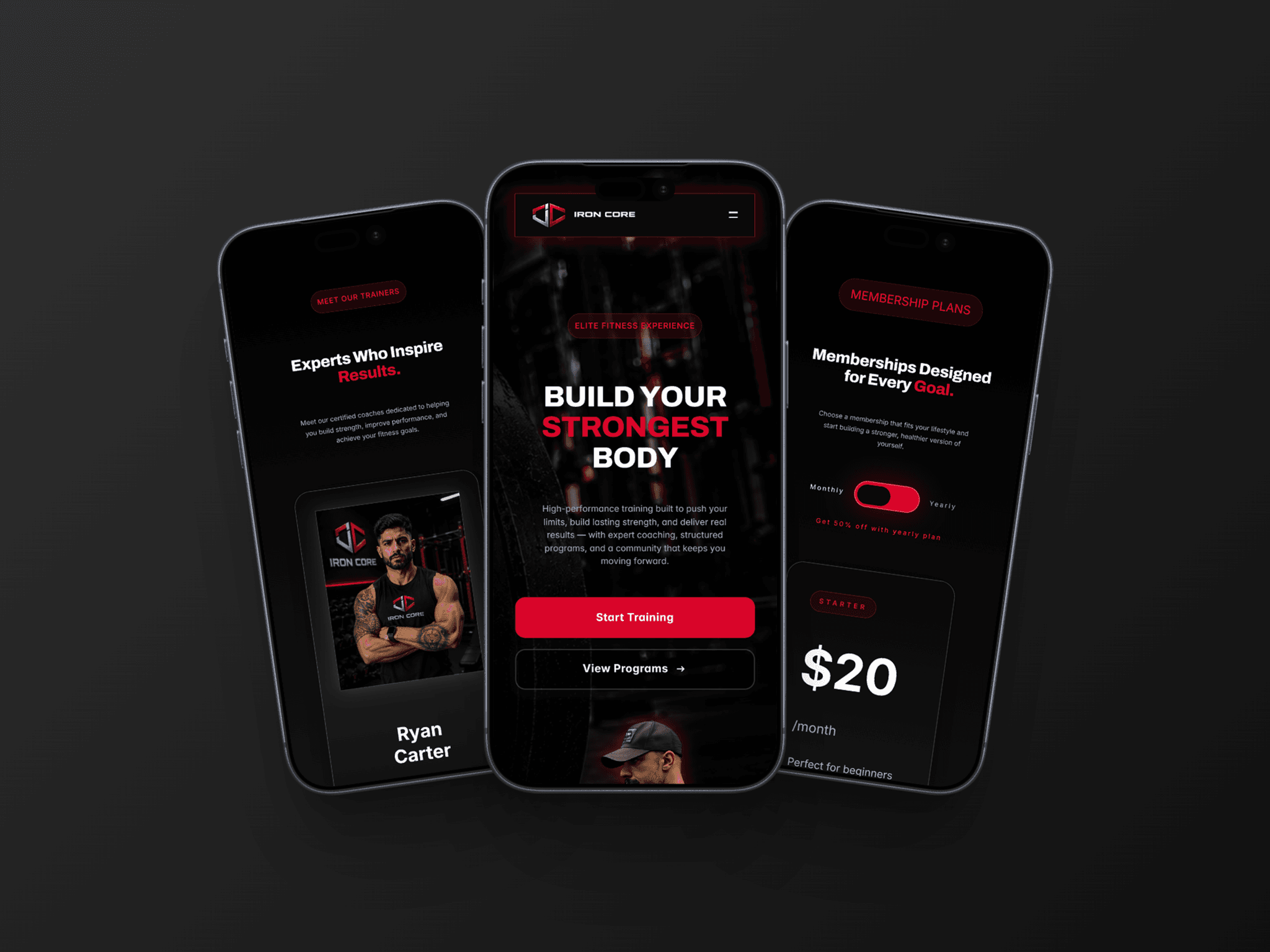
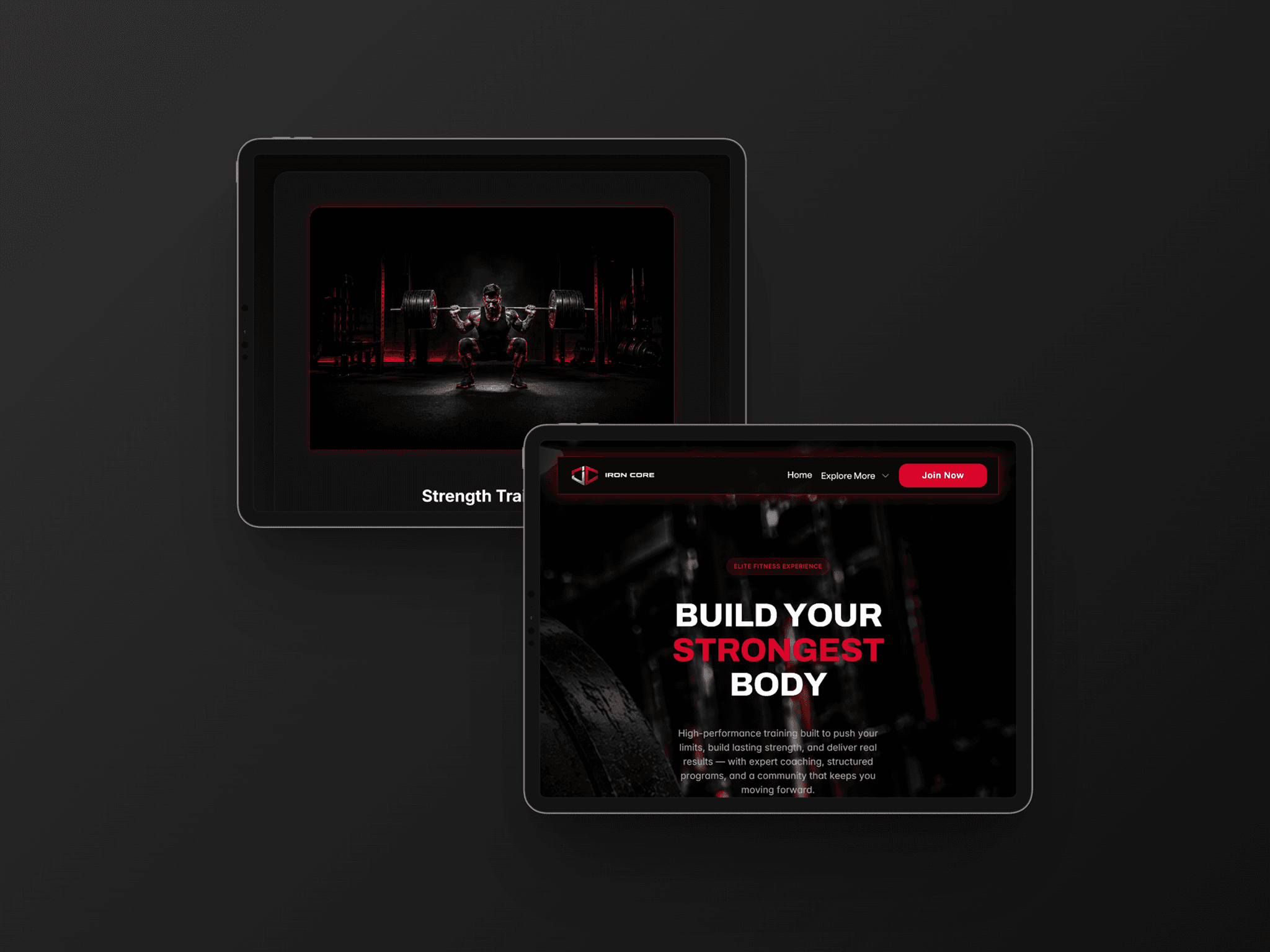
• Fluid Breakpoints: 100% fluid responsive scaling meticulously optimized across Desktop, Tablet, and Mobile viewports.

If you are a creator or agency looking to maximize your profit margin on a fitness client rollout this week, Iron Core provides a bulletproof foundation. I'd love to hear your thoughts on the spacing and typography hierarchy! 👇

🔗 Explore the interactive staging preview live: https://iron-core.framer.website/

🛒 Secure your master template license directly: https://framevia.lemonsqueezy.com/checkout/buy/d3aa122b-f239-418f-b401-0311174a3e59

Framevia | The Visual Pratik
Framevia | The Visual Pratik1w

Deep Dive: Engineering High-Contrast Contact & Lead Forms in Framer 📈✉️

Hey community! Taking a closer look under the hood at the frictionless lead-generation architecture styled inside Iron Core.

For any commercial gym or personal training studio, a website's ultimate success metric is how smoothly it captures inquiries. I structured this high-contrast consultation section to maximize completion rates while keeping backend integration completely flexible:

• Frictionless Typography Hierarchy: Bold, intentional messaging that drives user action smoothly.

• 100% Platform Agnostic: Built entirely clean on the front-end, meaning you can wire this form layout into any provider (Framer Forms, Hubspot, Formspree, or Mailchimp) in under 60 seconds.

• Flawless Mobile Scaling: Containers and input boxes are anchored with global padding tokens to ensure input fields never distort on smaller mobile screens.

If you are a creator or studio delivering a client site this week, this pre-styled module saves you hours of tedious form alignment. I’d love to know your thoughts on the input block layout! 👇

🔗 Explore the interactive form live on our staging preview: https://iron-core.framer.website/

🛒 Secure your master template license directly: https://framevia.lemonsqueezy.com/checkout/buy/d3aa122b-f239-418f-b401-0311174a3e59

Framevia | The Visual Pratik
Framevia | The Visual Pratik1w

Deep Dive: Engineering Friction-Free FAQ Accordion Modules in Framer ⚡🧩

Hey community! Taking a closer look under the hood at how Iron Core handles customer objections instantly through native FAQ accordion interactions.

When conversion optimization matters, reducing buyer friction right on the landing page is the absolute key to securing checkouts. I engineered this specific FAQ section using native Framer animations to ensure zero loading lag and crisp interactive feedback:

• Silky Smooth Accordion Triggers: Fluid expand-and-collapse micro-interactions built completely clean.

• Global Styling Architecture: Text elements and spacing parameters are tied straight to style tokens for effortless client customization.

• Conversion-Focused Layout: Keeps the user journey compact while systematically resolving pre-purchase doubts.

For independent creators and agencies managing a fitness client rollout this month, this module completely eliminates tedious interactive layout configuration. I'd love to hear your thoughts on the spacing hierarchy! 👇

🔗 Explore the interactive accordion flow live: https://iron-core.framer.website/

🛒 Secure your master template license directly: https://framevia.lemonsqueezy.com/checkout/buy/d3aa122b-f239-418f-b401-0311174a3e59

Framevia | The Visual Pratik
Framevia | The Visual Pratik1w

Hey community! Taking a closer look under the hood at how Iron Core manages conversion metrics through fluid social proof components.

For any modern fitness facility or personal training studio, the member transformation section is the absolute pivot point that converts casual web visitors into high-paying gym members.

I engineered this specific layout section to bridge the gap between heavy, cinematic visual contrast and ultra-fast frontend performance:

• Fluid Component Carousels: Smoothly scales sliding customer testimonials across all viewports.

• Clean Structural Padding: Transformation image arrays are locked using global style tokens to prevent any box clipping on mobile screens.

• Zero Bloat: Built purely with native Framer animations, making it exceptionally lightweight to load.

If you are building a commercial brand website for a gym client this month, this asset will save you days of repetitive layout styling. I'd love to hear your feedback on the layout spacing! 👇

🔗 Explore the interactive slider layout live: https://iron-core.framer.website/

🛒 Secure your master template license directly: https://framevia.lemonsqueezy.com/checkout/buy/d3aa122b-f239-418f-b401-0311174a3e59

Framevia | The Visual Pratik
Framevia | The Visual Pratik1w

Hey community! Taking a close-up look under the hood at the interactive Membership Tiers engineered inside Iron Core.

For any commercial gym or fitness studio website, the pricing grid is the absolute heart of the sales funnel. I meticulously structured this layout with crisp dark-mode contrast, a clear visual hierarchy for featured tiers, and fully fluid responsive padding tokens.

You can swap monthly rates, currency symbols, and text features for a client in a matter of minutes without ever breaking the tablet grids or mobile viewport constraints.

I’d love to know what you think of the visual hierarchy here! 👇

🔗 Test the interactive pricing switcher live: https://iron-core.framer.website/

🛒 Secure your master template license: https://framevia.lemonsqueezy.com/checkout/buy/d3aa122b-f239-418f-b401-0311174a3e59

Framevia | The Visual Pratik
Framevia | The Visual Pratikin Marketplace·2w

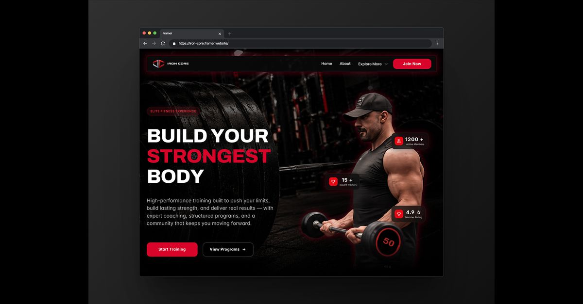
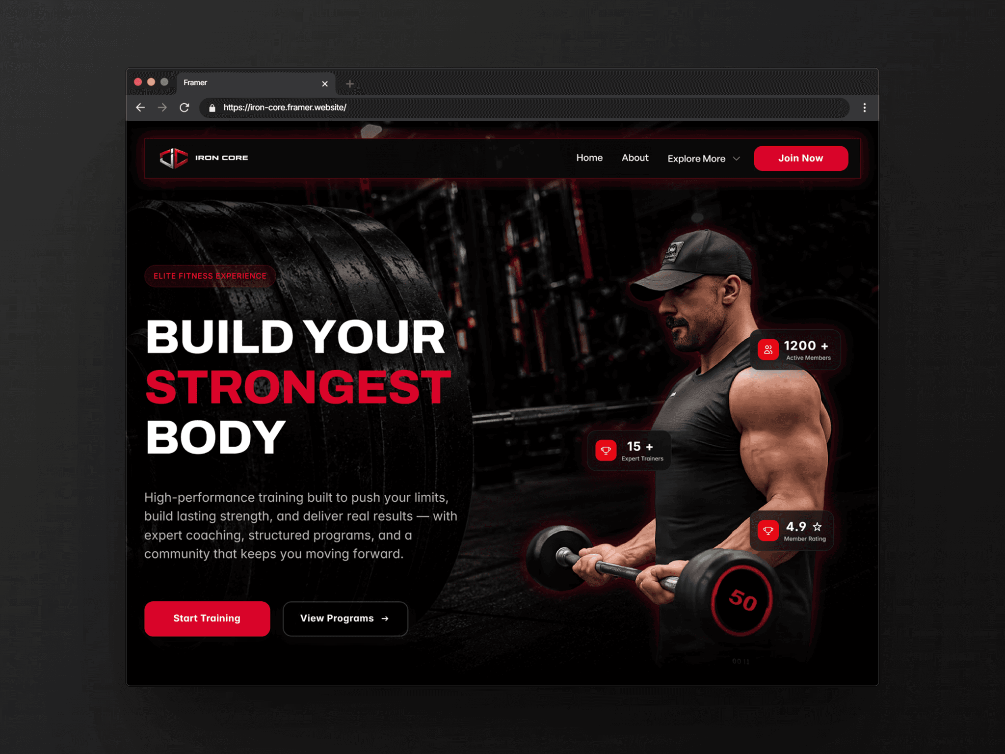
Introducing Iron Core — Premium Gym & Fitness Template 🏋️‍♂️🔥

Hey Framer Community! I’m incredibly excited to launch Iron Core, a premium, cinematic 13-page multi-page ecosystem engineered specifically for modern gyms, personal trainers, and performance studios looking for a bold, conversion-focused web presence.

⚡ Key Highlights:

• 13 Production-Ready Pages (Home, About, Programs, Membership, Contact, and more)

• Immersive dark aesthetic with premium custom interactive modules

• Desktop-exclusive Fixed Footer Reveal animation

• 4 Custom .tsx Code Components + 1 Custom Loader Override fully integrated

• Native Framer Layout Templates utilized for seamless global editing

• 100% fluid responsive design meticulously optimized across all breakpoints

Whether you are launching your own fitness brand or building a high-end layout for a client, Iron Core gives you a bulletproof, production-ready foundation.

Check it out on the marketplace or explore the interactive live preview below! I’d love to hear your thoughts and feedback! 👇

🔗 Live Preview: https://iron-core.framer.website/

Check Out 👉 https://framevia.lemonsqueezy.com/checkout/buy/d3aa122b-f239-418f-b401-0311174a3e59