Asif Aleem
Asif Aleem

Asif Aleem

On-demand creative partner for growing teams | Co-Founder & CDO, Brickclay | UI/UX · Web · Brand · Motion, on subscription

Creator6 Listings
Asif Aleem
Asif Aleem2d

A lot of hero sections in the feed today, so here is the test I run on every one I design.

Cover the headline. Can you still tell what the product does from the visual alone? If the image is pure decoration (a gradient, an abstract shape, a stock photo), the hero is working at half power. The strongest ones show the thing: an automation agency shows a workflow, a dashboard product shows the dashboard, a travel brand shows the place.

Then cover the image. Does the headline still carry a promise, not just a feature name?

When the visual and the words each pass on their own, together they hit twice as hard. Years into this and it is still the first thing I check.

What is your hero doing when the words are gone?

Asif Aleem
Asif Aleem5d

The template work buyers never see but Google does.

When someone buys a Framer template, they judge it on how it looks. What quietly decides whether their site gets found is the part they never open.

Before I ship, I set it up so the buyer inherits good SEO without knowing the term: a real heading order (one H1 per page, logical H2s), a filled meta title and description on every page, alt text on the meaningful images, and an Open Graph image so the link looks intentional when someone shares it.

None of this shows in the preview. All of it shows up three months later, when their page is the one that ranks. A template that is findable out of the box is worth more than one that only looks good.

Asif Aleem
Asif Aleem1w

One change this year quietly cut down my template support emails: I stopped absolutely positioning hero text.

If a headline is pinned to exact coordinates so it sits perfectly over a background, it breaks the moment a buyer swaps in copy that is longer or shorter than mine. So now I build the hero as a stack inside a section with a min height, space it with padding and gap, and set the background as a fill layer behind it. The buyer can rewrite every line and nothing drifts, on desktop or mobile.

Two minutes of setup, and I stop getting the "why is my text overlapping" email a week after purchase.

Curious what build habit has saved the rest of you the most cleanup later.

Asif Aleem
Asif Aleem1w

The Framer feature I use most on client work isn't a design one. It's the CMS.

Not just for the blog. Testimonials, logo walls, team bios, FAQs, even the little announcement bar at the top. My rule: if a piece of content will change more than once, it goes in the CMS.

Every section you hardcode is a section the client emails you to edit. Every one you put in the CMS is a section they update themselves and forget about. Costs about 20 extra minutes at build time, saves months of small requests after handoff.

Same logic if you sell templates: the more a buyer can edit without touching the canvas, the fewer support messages you get and the better the reviews.

Asif Aleem
Asif Aleem1w

I cut an animation from a template last week that I was proud of.

A hero headline that assembled letter by letter on load. It looked great in my demo. Then I tested it the way a buyer would: on a mid-range Android, on a slow connection, with a real headline twice as long as my placeholder.

It stuttered, and it delayed the one thing a visitor came for, the message. A nice effect that gets in the way of reading is not a nice effect.

I replaced it with a simple fade and rise on the whole headline. Faster, calmer, and it holds up no matter how long the copy runs.

Restraint is a feature in a template someone else has to live with. What is an effect you have talked yourself out of shipping?

Asif Aleem
Asif Aleem2w

A quick tip for illustration-heavy Framer sites: match the format to the art.

I build a lot of vector and illustration-driven pages, and most load-time wins come from format choices, not code. What I do on every build:

1. Flat vector art (logos, icons, spot illustrations): SVG. Crisp at any size and tiny in weight.

2. Detailed or textured illustration: WebP, not PNG. Same look at a fraction of the size.

3. Decorative background art: keep it in a CMS collection so I can lazy-load or swap it without touching the design.

Small calls, but they compound fast on pages carrying real artwork. Happy to help if anyone is wrestling with a heavy illustration page.

Asif Aleem
Asif Aleem2w

The fastest way to lose a template buyer: a layout that breaks the second they swap in their own copy.

After 19 years of design work, the check I never skip before shipping a Framer template:

Text set to fit, not fixed, so a longer headline reflows instead of overlapping.

Min height on hero sections, not a locked height, so a two-line subhead never clips.

A component variant for the empty state, so a missing image still looks intentional.

A template someone can edit without fear is the one they recommend.

What is the check you never ship without?

Asif Aleem
Asif Aleemin Gallery·2w

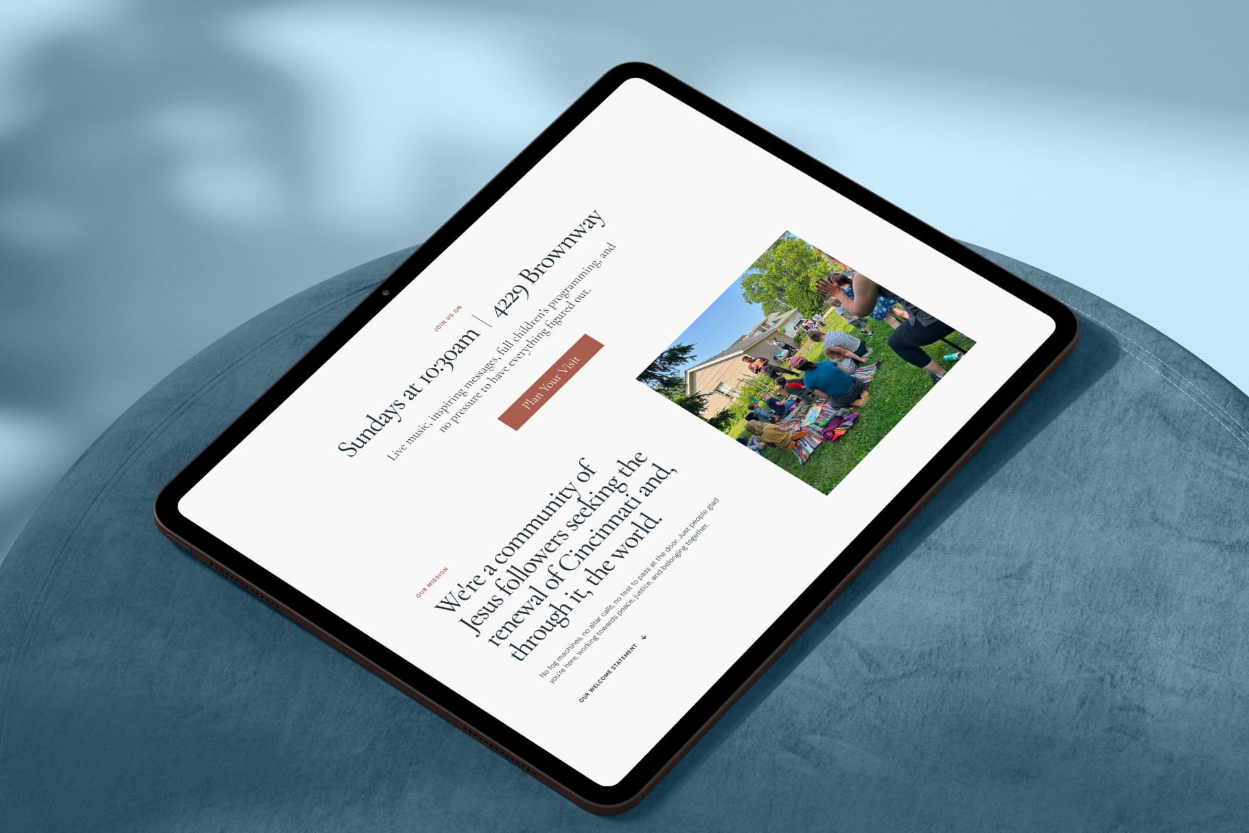
Excited to share the new website I designed and developed in Framer for City Peace Church, an affirming and inclusive Christian community in Cincinnati.

The goal was to create a warm, modern, and welcoming digital experience that clearly communicates the church’s mission, values, beliefs, and community work. I used thoughtful typography, authentic imagery, responsive layouts, clear navigation, and subtle interactions to help every visitor feel welcome and easily explore the community.

I would love to hear your thoughts and feedback.

Asif Aleem
Asif Aleem2w

"Contact us for a quote" quietly kills good leads.

After 19 years of design work, the pattern I trust: show a real price range early and let people self-qualify, instead of hiding the number behind a form. A visible range builds trust and filters for fit. A gated one just adds friction, and the strongest-fit people are often the least willing to chase it.

If you build an estimator in Framer, end it on a review step and make the email field the natural next action. The number is the value. The form is the afterthought.

Asif Aleem
Asif Aleem1mo

Most pricing sections quietly lose the sale, and it is not the price.

After 19 years designing sites, the pattern I see most on course, coaching, and service pages: the pricing section is built for the seller, not the buyer. It lists what the seller offers. It does not answer the one question the buyer is actually asking: which one is for me, and what happens if I pick wrong.

Four things that fix it:

1. Name the buyer, not the tier. "For solo founders" beats "Starter".

2. Anchor with a real "most popular". One visual focal point, not three equal columns.

3. Kill the fear. A refund line, a cancel-anytime, or a "talk to me first" link does more than another feature bullet.

4. Answer "what if I need more" right there, so nobody leaves to go hunting.

Price rarely kills a sale on its own. Uncertainty does.

What is the one line you always add to a pricing section that earns its place?

Asif Aleem
Asif Aleem1mo

The state most template buyers see first is the one you never designed.

Most Framer templates get built and previewed with a full, tidy set of demo content. Six testimonials, nine projects, a packed blog. Then a real buyer opens it with one testimonial and two projects, and the section that looked abundant now looks empty and off.

The fix I build into every CMS section now is to design the thin states on purpose:

One item: does the grid still balance, or does a lonely card float in dead space.

Zero items: is there a real empty state, or just a section header hanging over a gap.

Long content: does a 90 character title still sit right (size the text off its container, not a fixed value).

Demo content flatters the template. Sparse content is what the buyer actually has on day one. If it holds up empty, it holds up everywhere.

What is the first section that breaks for you when the content runs thin?

Asif Aleem
Asif Aleem1mo

The CMS text bug that makes a good template look broken in a buyer's hands.

You build the layout with tidy demo copy. The buyer pastes a headline twice as long, and suddenly it wraps into three lines and pushes everything off. The template looks broken, and it is not their fault.

The fix I put on every Framer build: size the text off its container, not a fixed value. Add a code override on the wrapping frame that sets container-type: inline-size, then set the font with clamp(14px, 12cqi, 40px). The 12cqi scales with the container width, and the clamp keeps it readable at both ends. A short title and a long one both sit right.

Buyers never see the override. They just notice nothing breaks when they make it theirs. That is the difference between a template that feels worth paying for and one that feels fragile.

Asif Aleem
Asif Aleem1mo

A pattern I keep noticing on Marketplace previews this week: the template is genuinely good, but the first frame is a hero shot with placeholder copy, and buyers scroll right past it.

The previews that convert answer one question fast, "can I picture my own site living here":

1. Lead with a frame that shows structure, not just style. A pricing block, a CMS list, a real footer. That signals the template is complete, not a one-page demo.

2. Include one mobile frame. Half the buyer's doubt is whether it holds up responsive.

3. Fill it with demo content from the buyer's world, not lorem. Real names, believable numbers, categories they recognise.

Ranking gets you seen. The preview sequence is what turns a view into a sale. Happy to give any listing a second pair of eyes on its frames if that is useful.

Asif Aleem
Asif Aleem1mo

The preview frame sells the template, not the listing copy.

After years of design work, the thing I underrated most on Framer: the first preview image does about 80 percent of the selling. Buyers decide in a second, before they read a word.

Three things that moved it for me:

1. Make the first frame match the landing hero, so the click and the page tell the same story.

2. Show the template doing its real job (a real section, real content), not a floating mockup on a gradient.

3. One clear idea per frame. A busy preview reads as a busy template.

Copy supports the decision. The image makes it. What is the one preview change that lifted your sales?

Asif Aleem
Asif Aleem1mo

A color trick that makes complex products click

When a product is abstract (AI, data, infra), the hard part is making it feel concrete. One move I keep coming back to in Framer: give each stage of the product its own hue.

Sourcing gets blue, onboarding purple, training a warm olive. Same card layout, one color per stage. The reader stops seeing one fuzzy thing and starts seeing a few clear moments.

Two rules that keep it clean:

1. Pull the hues from your existing brand palette, then shift value, not add chaos.

2. Carry those same colors into the deeper pages, so the map you draw up top keeps working as people scroll.

Cheap to build, and it does more for comprehension than another block of copy. What is your go-to for making a complex product legible?

Asif Aleem
Asif Aleem1mo

The scroll jank most Framer sites ship without noticing.

A site feels premium right up until you scroll on a mid-range phone and everything stutters. Almost always it is the same cause: too many scroll-linked effects firing at once.

Three fixes I apply on every build:

1. Cap concurrent scroll animations. One hero parallax plus one reveal per section is plenty. Stack five and the main thread chokes.

2. Animate only transform and opacity. Width, height, top, and box-shadow force a layout pass every frame. Swap them for scale and translate.

3. Test on a throttled device, not your M-series Mac. Chrome devtools, 4x CPU slowdown. If it holds there, it holds everywhere.

Smoothness reads as quality before a single word does.

Asif Aleem
Asif Aleem2mo

Tip: on a marketing site, perceived speed beats real speed.

What decides how fast a site feels is not load time, it is how the first section behaves. Three things I do on every Framer build:

1. Render the hero text instantly. Animate everything below it on scroll, never on load. A hero that fades in makes the whole page feel slow.

2. Keep entrance animations to 300 to 400ms. Longer reads as sluggish, not premium.

3. Lazy load below the fold and set explicit image sizes so nothing shifts while it loads.

None of this moves your Lighthouse score much. It changes the part that matters more: whether the first five seconds feel effortless.

Asif Aleem
Asif Aleem2mo

How to break the green-grid look in AI hero sections

I have looked at a lot of AI landing pages this month and almost all of them reach for the same hero background: a green wireframe or particle topography on near-black. It reads as "AI" instantly, which is exactly the problem. When every AI brand uses the same shorthand, it stops signaling "AI" and starts signaling "same as the last ten sites".

If the brand promise is trust, calm, or being the un-hyped option, the default look quietly works against it. Three ways I break out of it:

1. Pick the palette from the emotional job, not the category. A restrained mono or a warm amber can feel more premium and more human than another neon-green grid.

2. Run one accent through the hero and the CTA so the section reads as one system, not a stock background with buttons dropped on top.

3. Fade any pattern out before the logo row so social proof keeps its contrast.

The layout is usually already strong. The background is where most AI sites quietly give away their originality. What are you using instead of the green grid?

Asif Aleem
Asif Aleem2mo

A small template detail that quietly costs trust: stat counters that animate up from zero.

I keep seeing studio and portfolio templates where the numbers block reads 0+ projects, 0 clients, 0 years. On a fast connection the count-up hides it. On a slow load, or when a buyer forgets to edit the defaults, the live site just sits on 0 clients. That is the opposite of what the section is there to do.

Two fixes I use:

1. Seed real-looking defaults in the template itself (40+, 6, 12), never 0. It demos well, and a rushed buyer still ships something credible.

2. Start the count-up near the end value instead of from 0, so a slow frame never parks on nothing.

Same logic covers empty CMS states, placeholder testimonials, and Lorem that sneaks to production. Design the default for the person who forgets to change it.

If you build templates, what is your rule for placeholder content?