


Anubhav5d
Rejected hero concept 🫠
Anubhav1d
Tried a much quieter version of the same hero this time. What do you think?
Anubhav5d
Rejected hero concept 🫠
Anubhav3w
Noren is my 3rd attempt at a real estate template.
This time I wanted it to feel more like a development studio than a typical property website, with the projects taking center stage.
I think I got much closer with this one. What do you think?
Anubhav3w
Atelier was my first real attempt at going fully editorial.
For an architecture studio, I didn't think the website needed to explain everything immediately.
The work itself should do a lot of the talking.
So with Atelier, I gave the imagery and typography way more room and built the layouts around that.
Made sense for the niche, and it also made the site way more fun to design.
Anubhav3w
I love making contact pages more than any other page.
Something about taking a form that could be boring as hell and making it feel like an actual part of the website.
This one is from Noren.
Anubhav3w
I love making contact pages more than any other page.
Something about taking a form that could be boring as hell and making it feel like an actual part of the website.
This one is from Noren.
Anubhav1mo
Finally got around to showing the About page for Noren.
This one has a lot of small movements that you probably won’t notice individually, but together they make the page feel really nice.
Anubhav1mo
One of my favorite hero sections from Noren.
Really like how the image works with the title here. Feels clean without being too empty.
Anubhav1mo
One of my favorite hero sections from Noren.
Really like how the image works with the title here. Feels clean without being too empty.
Anubhav1mo
A closer look at the Team section from my latest template, Noren
I wanted to avoid the usual team grid where every person gets the exact same card. So I made one person the main focus, then used the other two underneath to balance the layout and the different image sizes also break the rhythm a bit without making the section feel all over the place.
Pretty simple structure, but I really like how it turned out.
Anubhav1mo
A closer look at the Team section from my latest template, Noren
I wanted to avoid the usual team grid where every person gets the exact same card. So I made one person the main focus, then used the other two underneath to balance the layout and the different image sizes also break the rhythm a bit without making the section feel all over the place.
Pretty simple structure, but I really like how it turned out.
Anubhav1mo
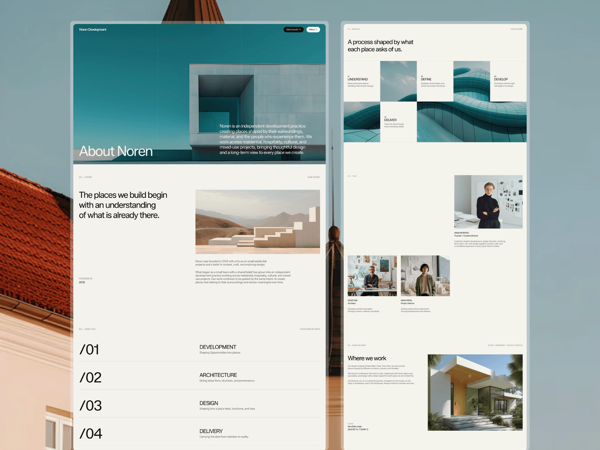
Home and about page for Noren.
Wanted it to actually feel like a real estate/development brand. Spent way too long on the spacing honestly and gave everything room to breathe.
If you're building something in this space, structure's already there, brand voice already sounds right, just drop your content in.
Anubhav1mo
Home and about page for Noren.
Wanted it to actually feel like a real estate/development brand. Spent way too long on the spacing honestly and gave everything room to breathe.
If you're building something in this space, structure's already there, brand voice already sounds right, just drop your content in.
Anubhav1mo
Project detail page for Noren's projects
Anubhav1mo
About page, story section this time.
Kept most of the writing in the copy itself, headline does the work. Just added founded year and a short paragraph under it, nothing more.
Didn't need to overdesign this one.
Noren is now live.
A premium Framer template for architecture studios, property developers, real estate firms, and creative practices.
I wanted to build something that felt more like an architecture publication than another real estate website.
Large imagery, editorial typography, considered spacing, project storytelling, and a CMS structure designed around the work.


Anubhav1mo
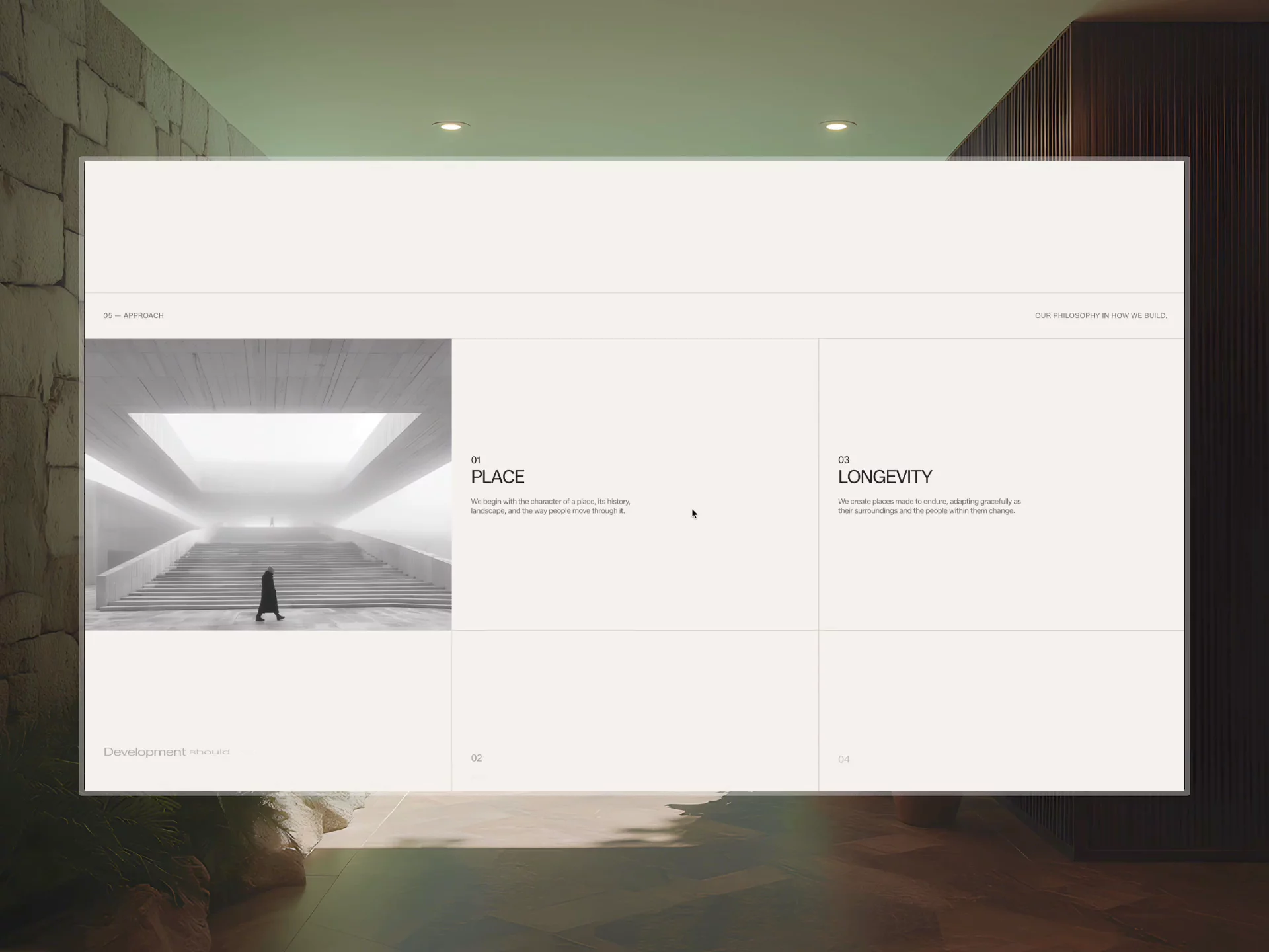
Been going back and forth on how to lay out Noren's practice section.
Tried cards first, then a grid, and nothing felt right honestly
Ended up just going with a plain numbered list, big numbers, etc. Way simpler than what I was trying before.
Should've started here tbh.


