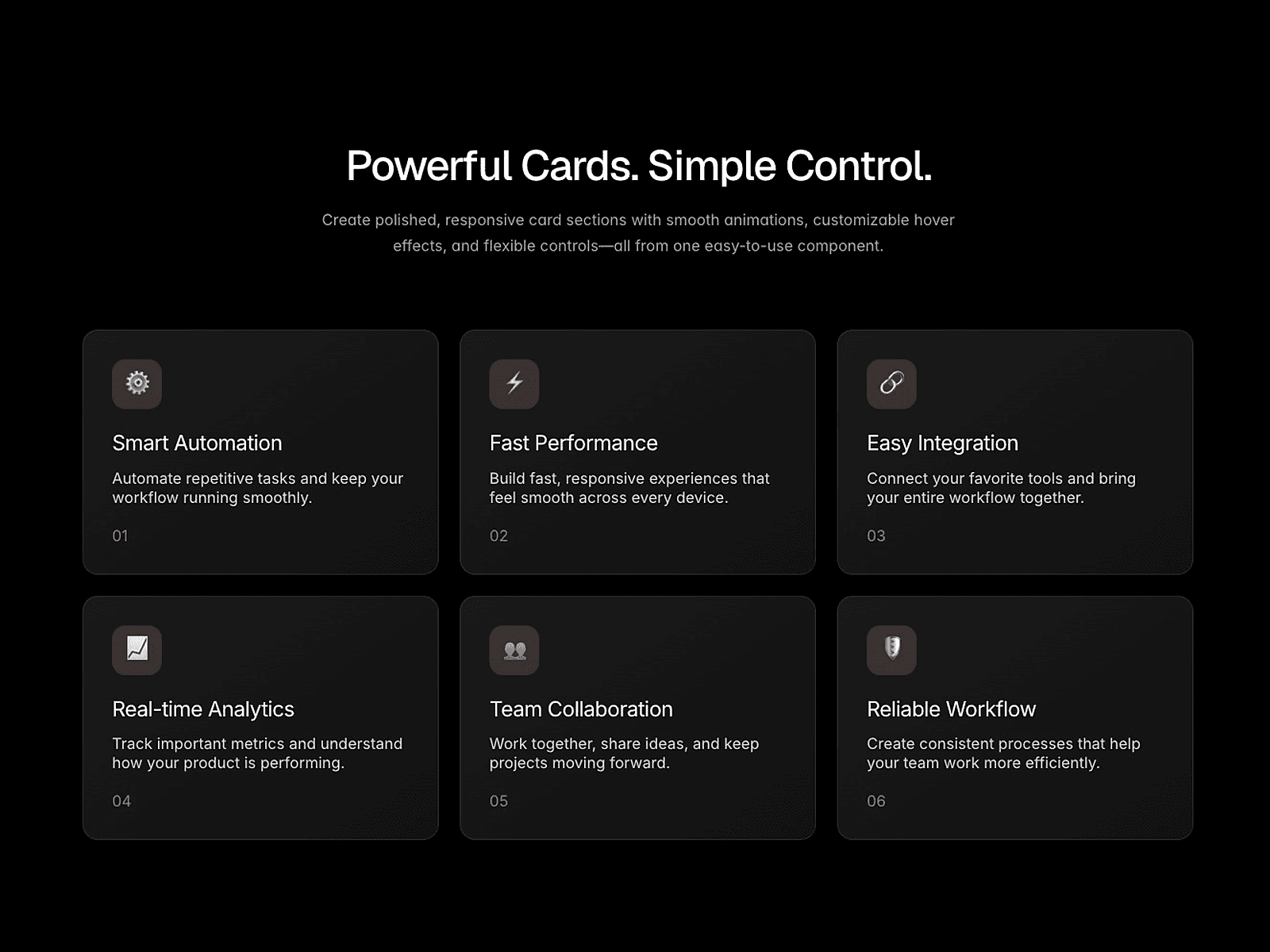
About WebX Stack Cards
✦ Scroll sections that feel physical
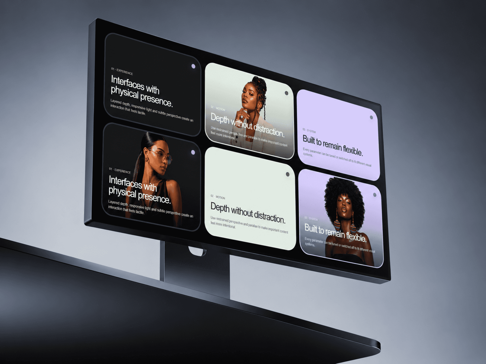
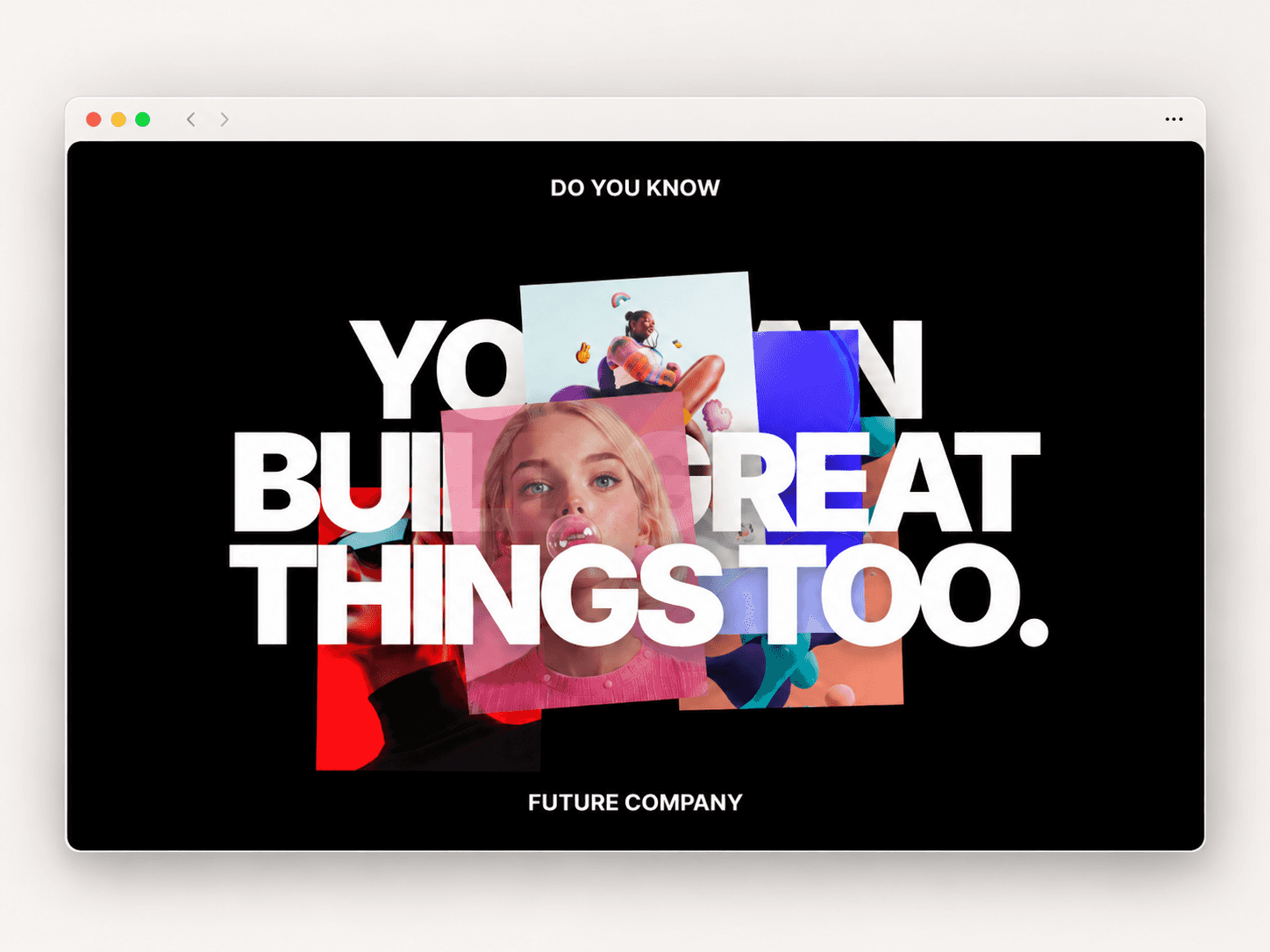
Scroll Stack Cards turns ordinary content cards into a layered, dimensional scroll experience.
As visitors move down the page, each card enters with depth, settles into focus, then recedes into the stack behind it. Scale, perspective, brightness and shadow work together to create a polished physical-card effect without complex setup.
Ideal for services, features, process steps, portfolios, presentations and editorial storytelling.
Customize every card
Add up to 10 cards directly from the Framer property panel.
Control each card’s:
Number
Title
Description
Background color
Text color
You can also customize dimensions, spacing, corner radius, typography, shadows, watermark numbers and the folded-corner treatment.
Control the scroll effect
Fine-tune how cards behave before, during and after they become active.
Adjust scale, perspective rotation, brightness, shadow intensity, stack spacing, scroll distance, sticky position and animation timing.
The motion is linked directly to scroll, creating a smooth, natural transition instead of a simple entrance animation.
Built-in Playground
Enable the optional Playground so visitors can experiment with:
Depth
Stack intensity
Corner radius
Corner fold
Useful for demos, portfolios and component showcases.
Responsive by default
Scroll Stack Cards can adapt its width to the viewport while maintaining configurable page insets.
Key features
Scroll-driven stacked cards
Smooth 3D perspective transitions
Up to 10 customizable cards
Independent card colors and content
Responsive width support
Custom typography controls
Adjustable scale, rotation and brightness
Configurable shadows
Large watermark numbers
Optional folded-card detail
Built-in Playground
Fully customizable in Framer
No-code setup
Drop it onto the canvas, add your content and turn a standard vertical section into something people want to scroll through.
For support: hello@bodilum.com