About Metal Rim Button
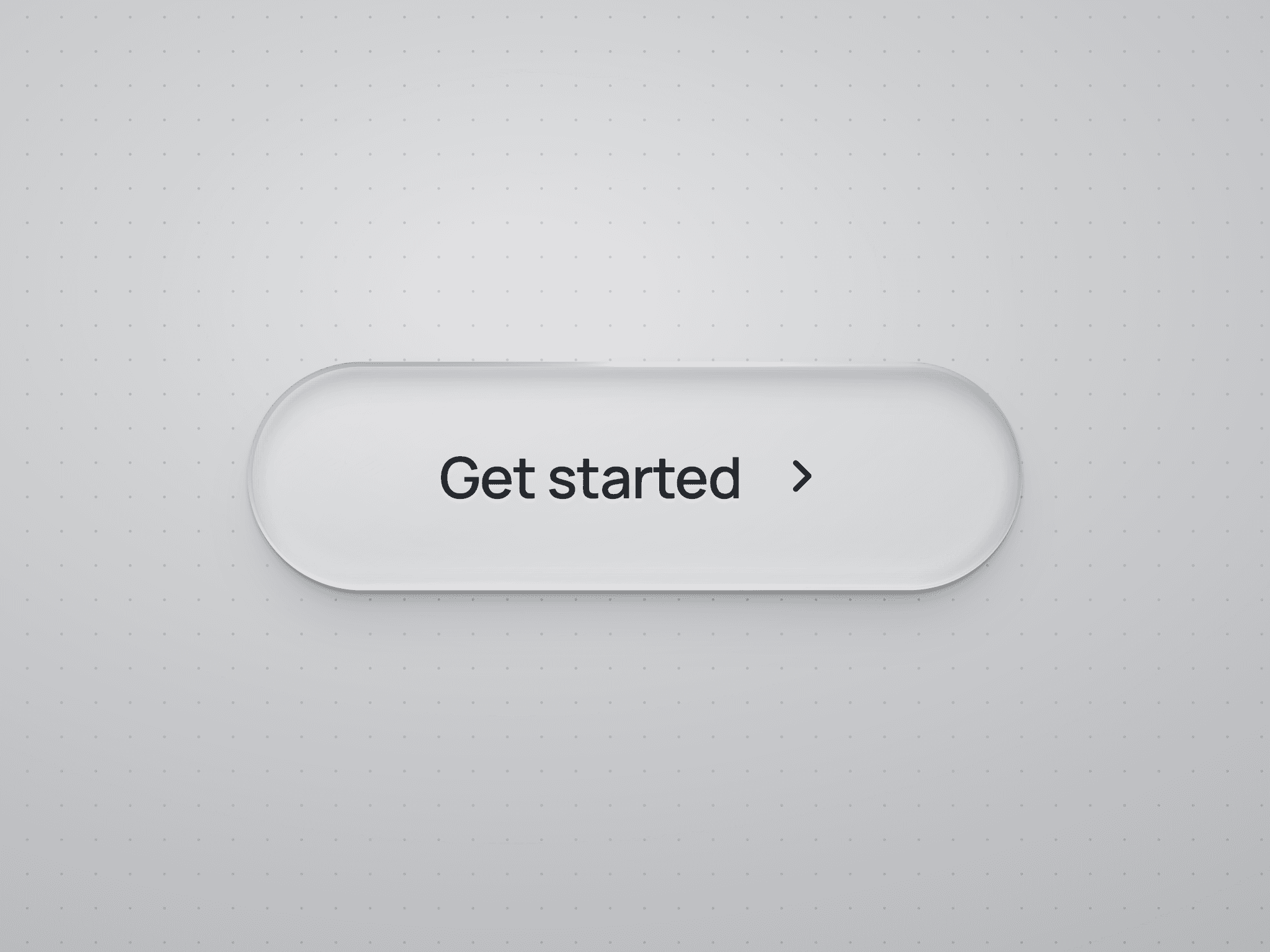
Metal Rim Button is a glossy pill CTA for Framer, wrapped in a thin rim of moving liquid chrome. The metal stays mostly black, with soft flashes of orange, red, purple and blue drifting through it. On hover the icon launches up and out while a fresh one slides in from below, and a light glint sweeps across the face. It is built entirely from native Framer layers and a Liquid Gradient shader, so there is no code to manage and every detail stays editable on the canvas.
How to Use
1. Drop Metal Rim Button onto any page and pick a Variant: Default, Large, Dark or Large Dark. Light versions use a bright glossy face, dark versions a deep graphite face.
2. Set the button text with Title, and point it to any page, section or external URL with Link.
3. Choose any Lucide icon with Icon, or switch off Show Icon for a clean text-only pill.
4. Preview the page and hover to see the launch, glint and shadow lift. Click and hold to see the pressed state.
5. To recolor the chrome, open the component and select the Liquid Metal layer to adjust its colors, contrast and speed. Keep the speed the same in every state so the flow never resets on hover.
6. Change the font, padding, radius or face colors right on the canvas. The rim scales with the button, so it works from compact nav buttons to big hero CTAs.
Ideal Use Cases
Metal Rim Button works well for:
• Hero sections that need one standout call to action
• SaaS, AI and product launches with a premium feel
• Portfolios and agency sites that want a crafted, tactile detail
• Waitlist, pricing and sign-up pages that need a clear primary action
One small button, a lot of shine.