About Stacked Sync Cards
Stacked Sync Cards – Scrollable Card List with Click-to-Sync Image
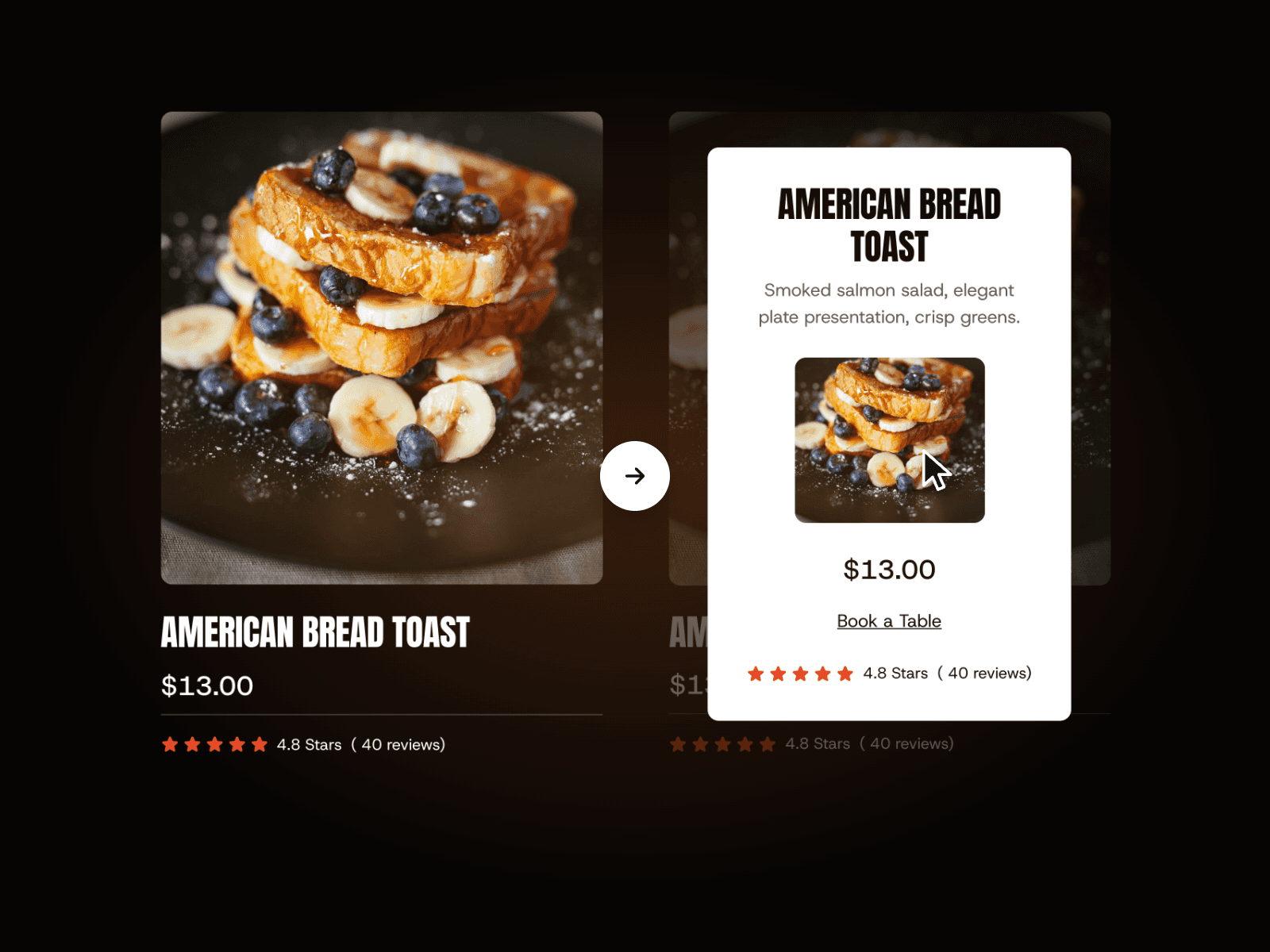
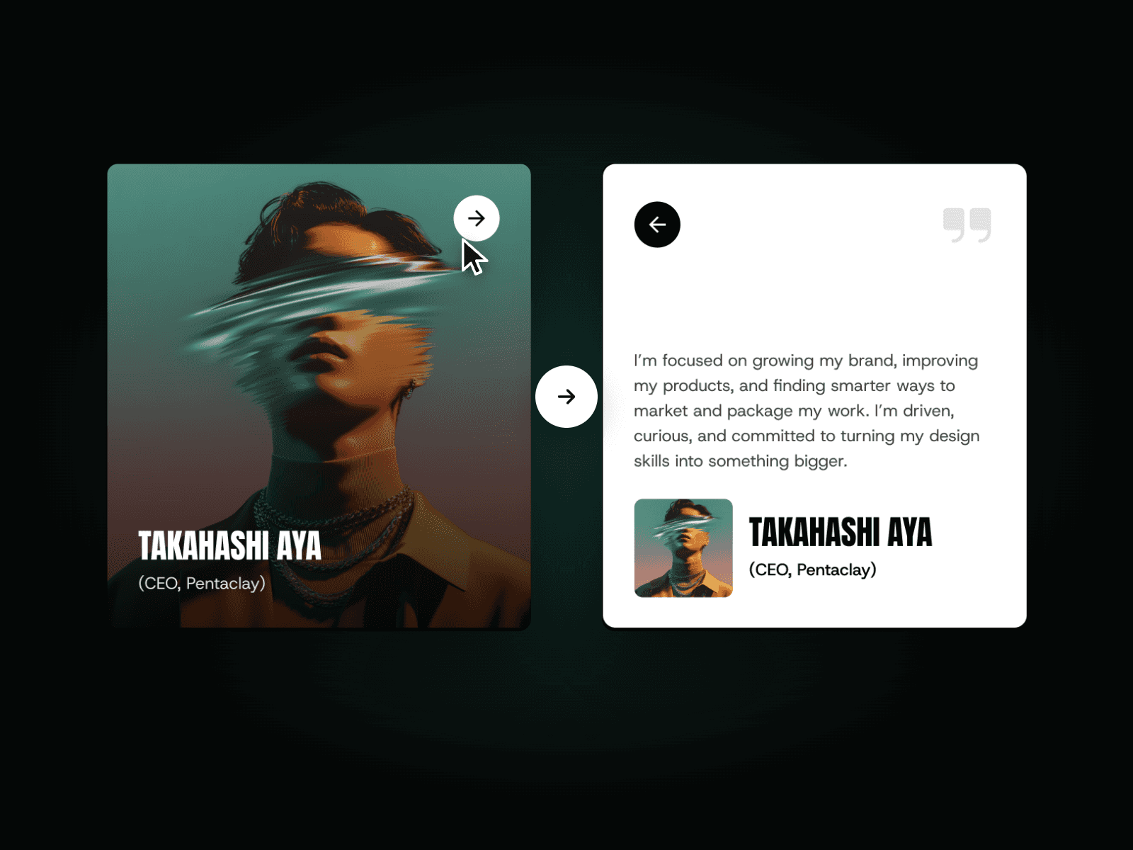
Stacked Sync Cards is a modern, interactive Framer component that pairs a scrollable stack of content cards with a large synced image panel. Instead of showing every service or topic with its own static image, it displays a clean stack of titled cards that scroll vertically, and updates the side image the moment a visitor clicks a different card. The seamless image sync gives your consultancy, agency, or corporate site a premium, editorial feel with almost no setup required.
Click-to-Sync Interaction
Cards stack and scroll vertically within the section.
Side image updates in sync with the clicked card.
Smooth crossfade transitions feel natural and intentional.
Fully responsive and optimized for modern GPU-accelerated performance.
Customizable Design Controls Stacked Sync Cards includes full Framer property controls so you can instantly match it to your brand or layout.
Customize
Cards – Add, remove, or reorder as many cards as needed.
Title – Edit the heading per card.
Text – Edit the body description per card.
Image – Assign a unique image to each card, shown in the synced panel.
How It Works Stacked Sync Cards tracks click events across the scrolling card stack. When a visitor clicks a card, the component crossfades the side image to match, while the card stack continues to scroll smoothly through the remaining titles and descriptions. This keeps the visual focus tied to whichever card the visitor is engaging with, making the experience feel fluid and cohesive.