About Responsive Blog Card
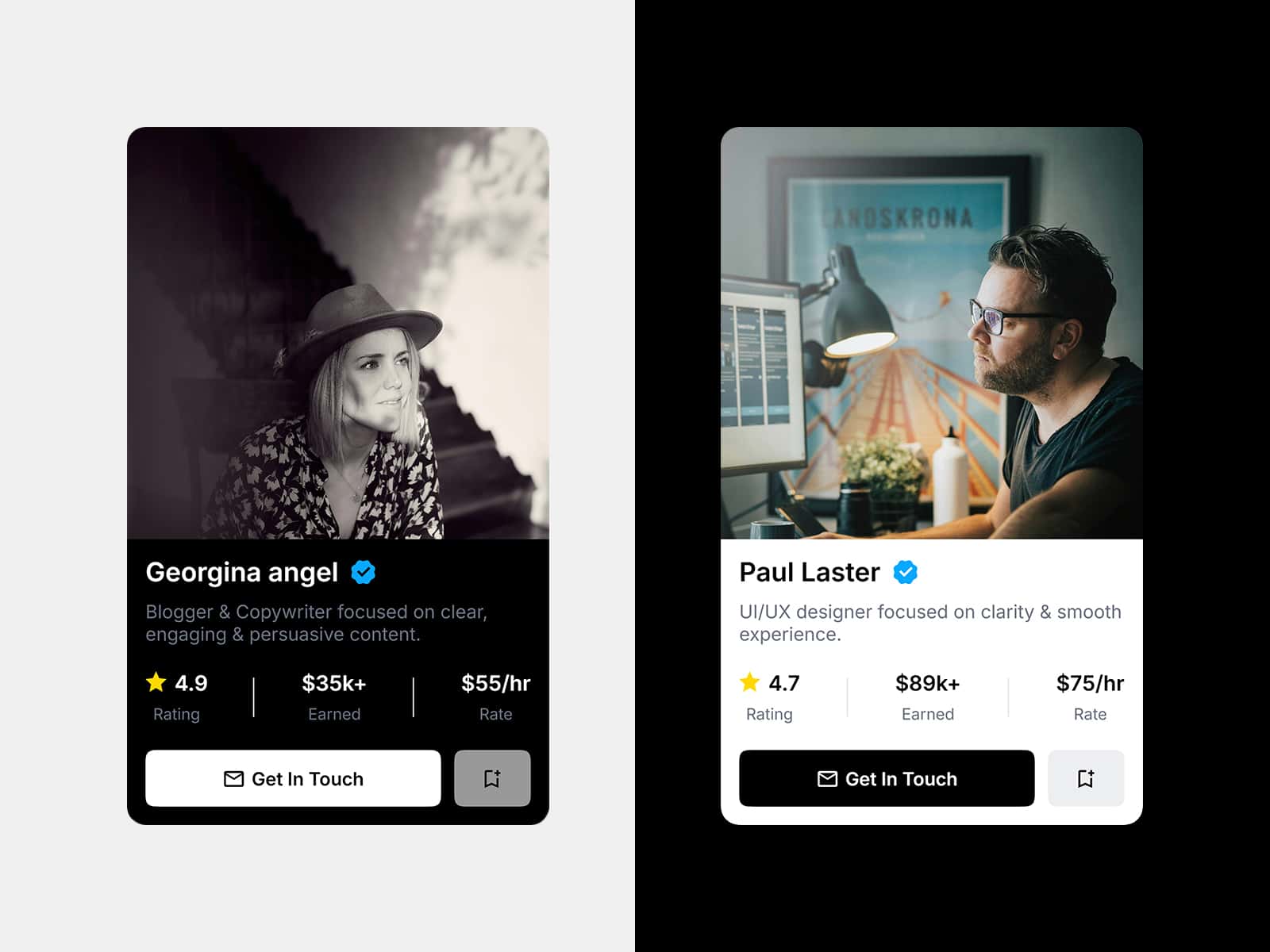
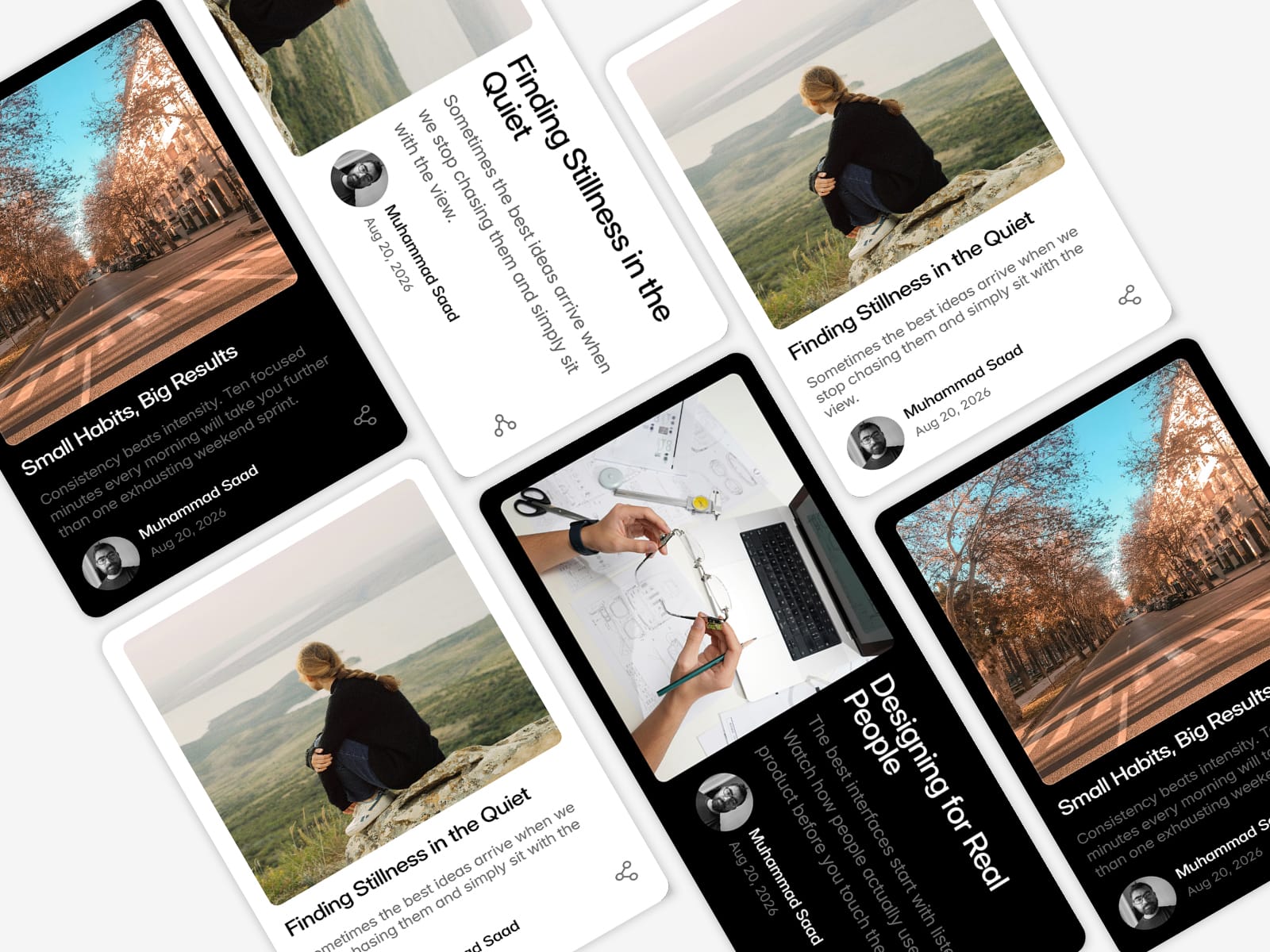
Blog Card is a ready-to-use article card for Framer, built in horizontal and vertical layouts, each with a light and dark theme. Every piece of content and style is exposed as a property, so you can customize it entirely from the panel — no need to open the component.
Drop it into a CMS collection, a grid, or a single page. It's built to hold its layout across screen sizes, with independent title sizing for mobile and desktop.
Key features
4 variants: Horizontal / Vertical × Light / Dark
Fully editable from the properties panel — nothing requires detaching or editing the source
Independent title size for Mobile and Desktop, so the title stays balanced at every screen width
Separate corner radius controls for the card, the featured image, and the author avatar
Border control on the featured image
Grayscale overlay control on both the featured image and the author avatar
CMS-ready — connect Featured Image, Title, Excerpt, Author, Author Image, and Publish Date to your collection fields
No code, no plugins required
Editable properties
Featured - Img — the post's main image
Featured-Img Border — border style on the featured image
Featured-Img Overlay — grayscale/overlay strength on the featured image
Author — author name text
Author-Img — author avatar image
Author-Img Overlay — grayscale/overlay strength on the author avatar
Title — post title text
Title - font - M — title font size on mobile
Title - font - PC — title font size on desktop
Excerpt - Text — short description text
Card - radius — corner radius of the card
Featured-image - radius — corner radius of the featured image
Author-image - radius — corner radius of the author avatar
Publish date text — date shown under the author name