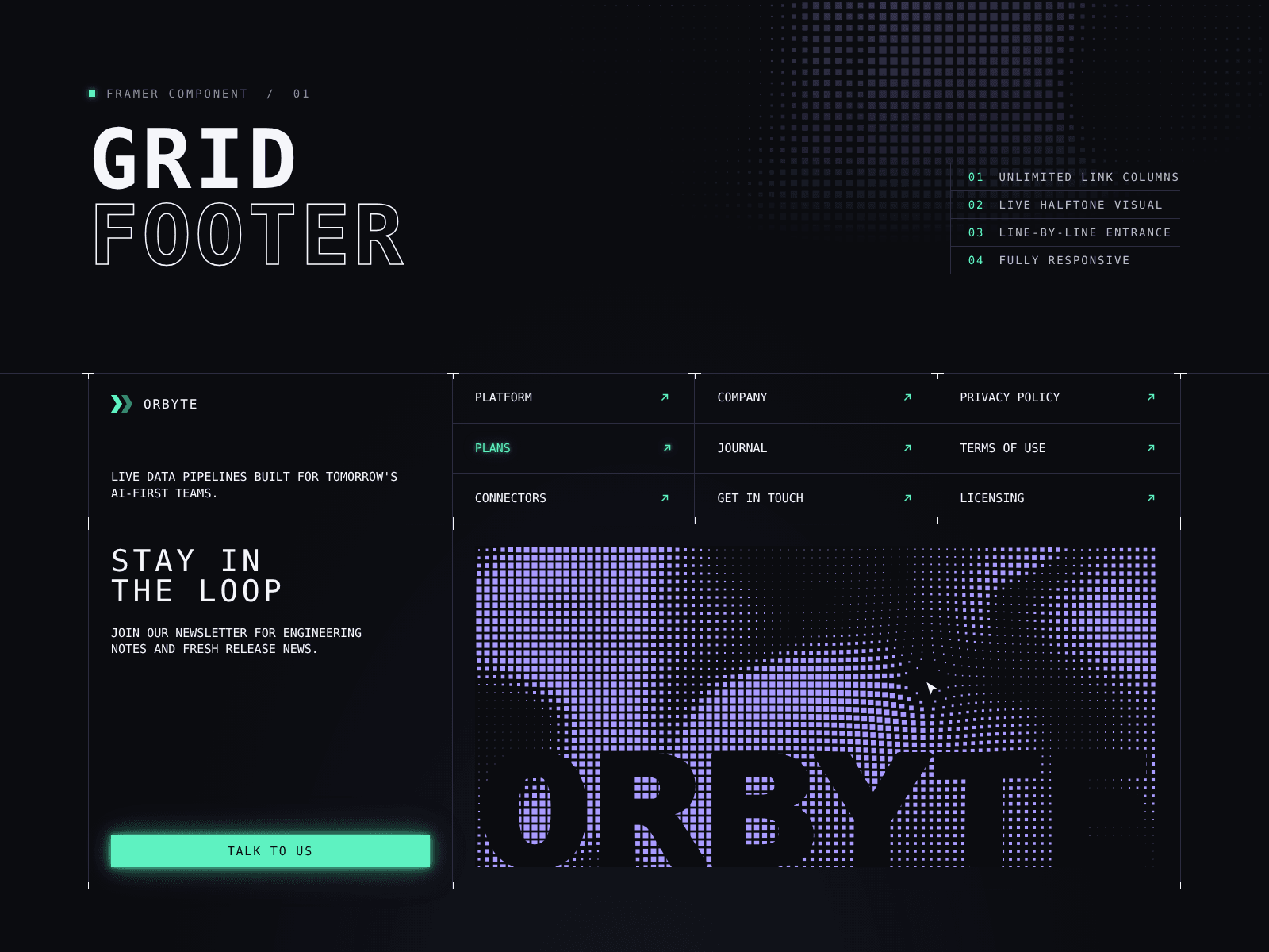
About Halftone Grid Footer
Halftone Grid Footer
is a technical, blueprint-style footer for Framer. A logo and tagline sit beside link columns on top, with a newsletter call to action and an animated halftone visual below, all framed by thin grid lines and cross markers at every intersection.
Features:
Unlimited link columns with unlimited links each, plus a new-tab option per link
Animated halftone dot field drawn on canvas, with speed, sparsity, warp, dot size and gap controls
Optional cursor push effect that moves the dots away from the pointer
Swap the visual for your own image or video (with poster)
Large wordmark overlay with its own text, color and font
Custom logo upload, or a built-in icon with an editable color
6 link icons: diagonal arrow, arrow, chevron, triangle, plus or none
Roll-up text hover and soft glow on links and the button
Scroll entrance: lines draw in, markers pop, text reveals line by line
Animation speed, delay and replay-on-scroll controls
Full control over colors, fonts, line color, marker color, uppercase, max width, cell padding and spacing
Responsive: stacks on mobile, with editable breakpoints for stacking and for side lines and markers
Respects reduced-motion settings and only animates while in view
No external fonts, scripts or dependencies
How to use:
Drop the component into your page and set its width to fill.
Upload your logo and edit the brand name and tagline.
Add or remove columns and links in the Columns panel.
Set the heading, description and button link.
Pick halftone, image or video for the visual and tune colors under Layout.
Great for SaaS, AI, dev tools, startups, agencies and portfolio sites that want a clean, modern, grid-based footer.
Tags: footer, grid footer, halftone, animated footer, newsletter, dot pattern, canvas animation, grid lines, blueprint, technical, monospace, dark mode, SaaS, AI, startup, developer, responsive, hover effect, scroll animation