About Dynamic Progress Bar
Circular Progress Bar — Animated Progress Ring with Centered Value Display
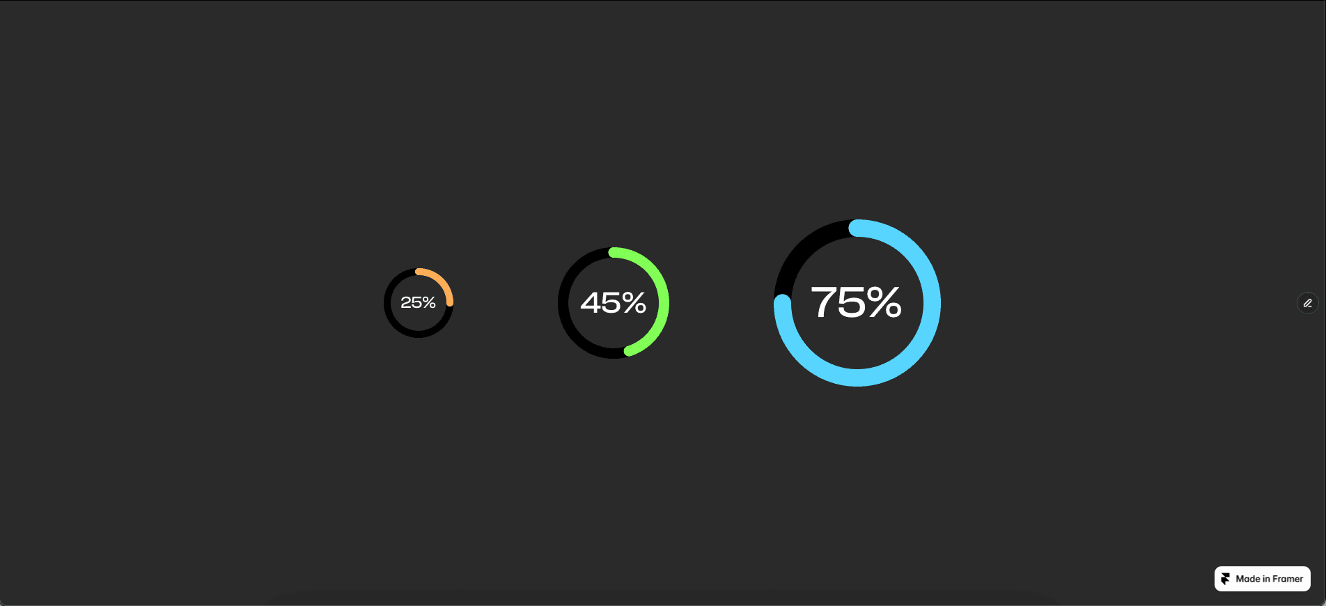
Circular Progress Bar turns numeric data into an engaging visual indicator. A sleek circular ring animates from zero to your set percentage, with the value centered inside. Ideal for completion rates, skill levels, performance metrics, or loading states on dashboards, portfolios, and trackers, with zero setup required.
Animated Progress Visualization
Animates smoothly from 0% to the target value with fluid easing.
Centered value text updates in real time as the value changes.
Subtle background track with a bold progress fill in the foreground.
Fully responsive and GPU-accelerated.
Customize
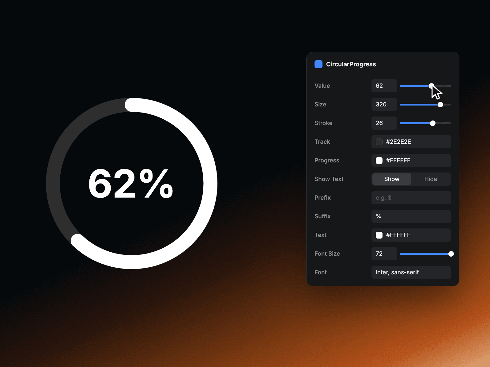
Value – Any number from 0 to 100.
Size – Overall diameter of the ring.
Stroke – Ring thickness, from hairline to bold.
Track – Background ring color.
Progress – Fill color of the animated ring.
Show Text – Toggle the center label on or off.
Prefix & Suffix – Add characters like $, # or % around the number.
Text – Color of the centered value label.
Font Size & Font – Match the label to your site's typography.
How It Works Set or change the value prop and the component calculates the percentage, smoothly animating the stroke to fill the ring while the centered text updates at the same time. Whether driven by a timer, user interaction, or external data, your metrics feel dynamic and alive.