About CMS Link Carousel
Use it with the CMS in three steps: 1) Add a Collection List to your page, turn off its Pagination and design one item with layers named Image, Title and Body. 2) Drop the Collection List into Cards (CMS). 3) Publish or preview: every CMS item becomes one card (a copy of your item design), and a link on the item opens its CMS page.
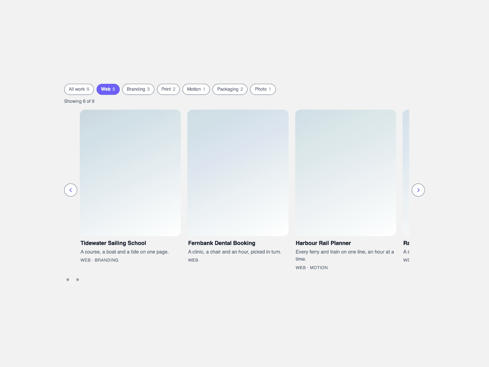
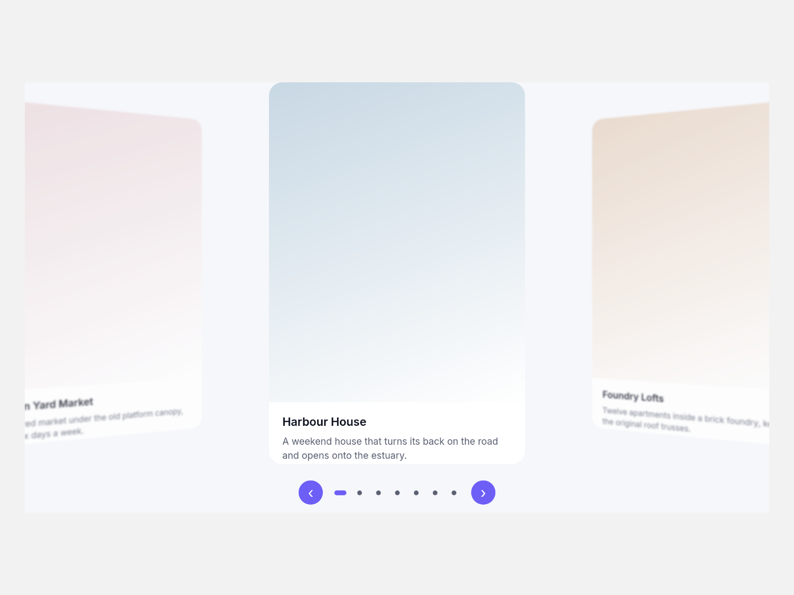
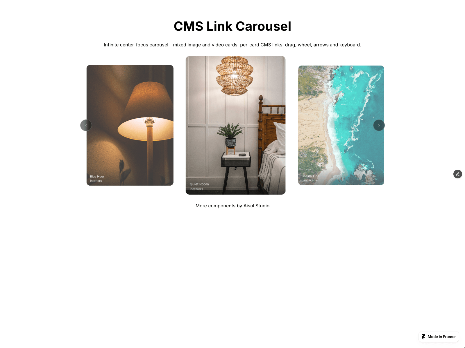
An infinite center-focus carousel for images, videos and CMS items. The middle card is full size, side cards shrink and fade, and the track loops without duplicating any card.
- Real CMS support: Cards (CMS) reads your Collection List and shows a copy of each item, so your list stays untouched. Cards update when items are added or removed. The list is hidden after reading, so a Load more button is not shown.
- CMS cards are static copies: Framer hover effects, interactions and nested code components inside an item do not run in the carousel. Links still open.
- No CMS needed: build cards by hand in Items with an image or video, title, caption and link.
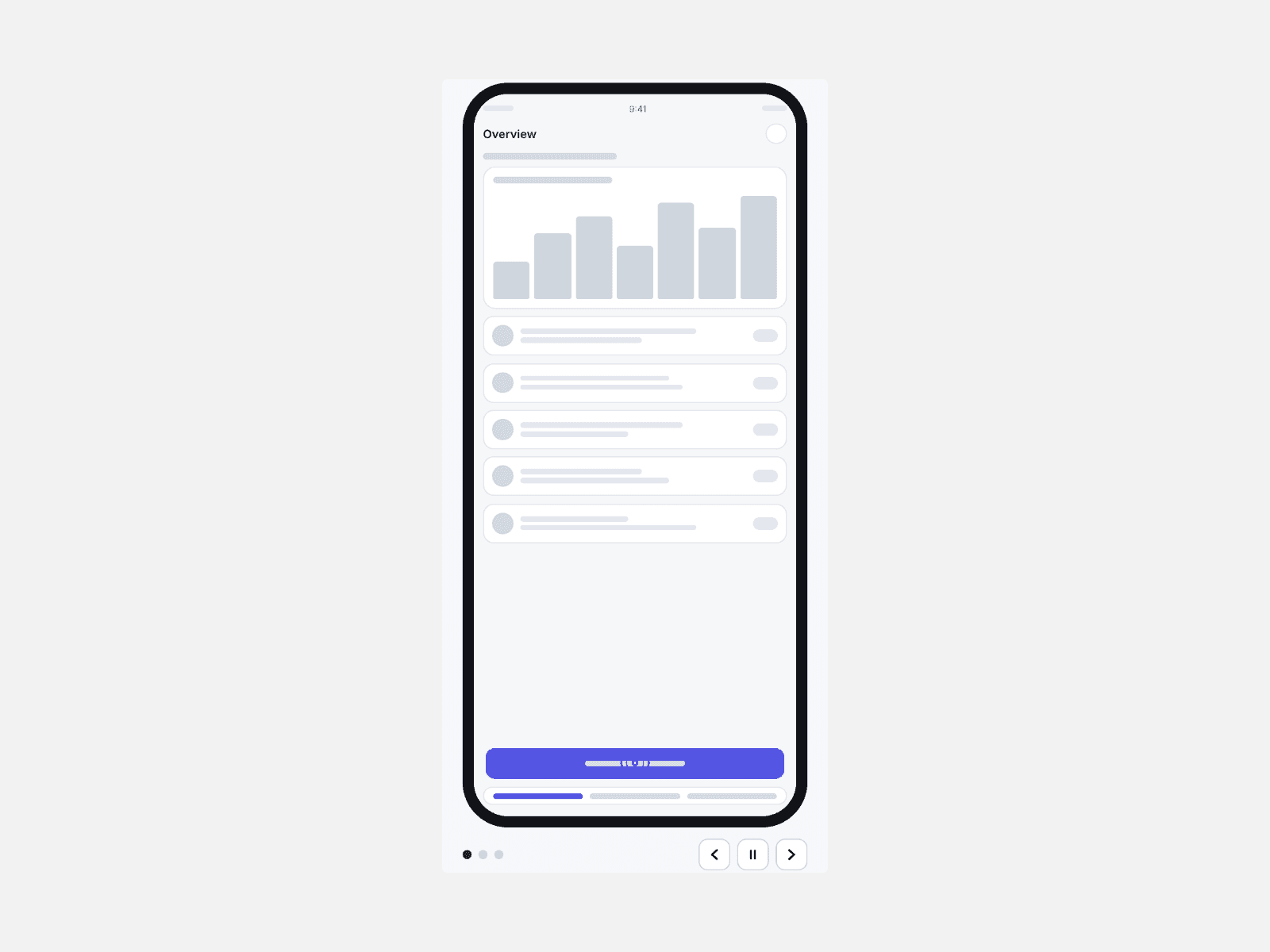
- Arrows, keyboard (Left, Right, Home, End), drag or trackpad swipe. A drag never opens a link; a tap does. Videos play only while centered.
- Accessible: labelled controls, a "Slide 2 of 6" announcement, reduced motion turns off autoplay.
- 1 to 6 cards in view with tablet and mobile counts.
- Style CMS Layers gives CMS items the hand-made caption look; turn it off to keep your design.
The canvas shows a static preview; the carousel moves in Preview and on the site.