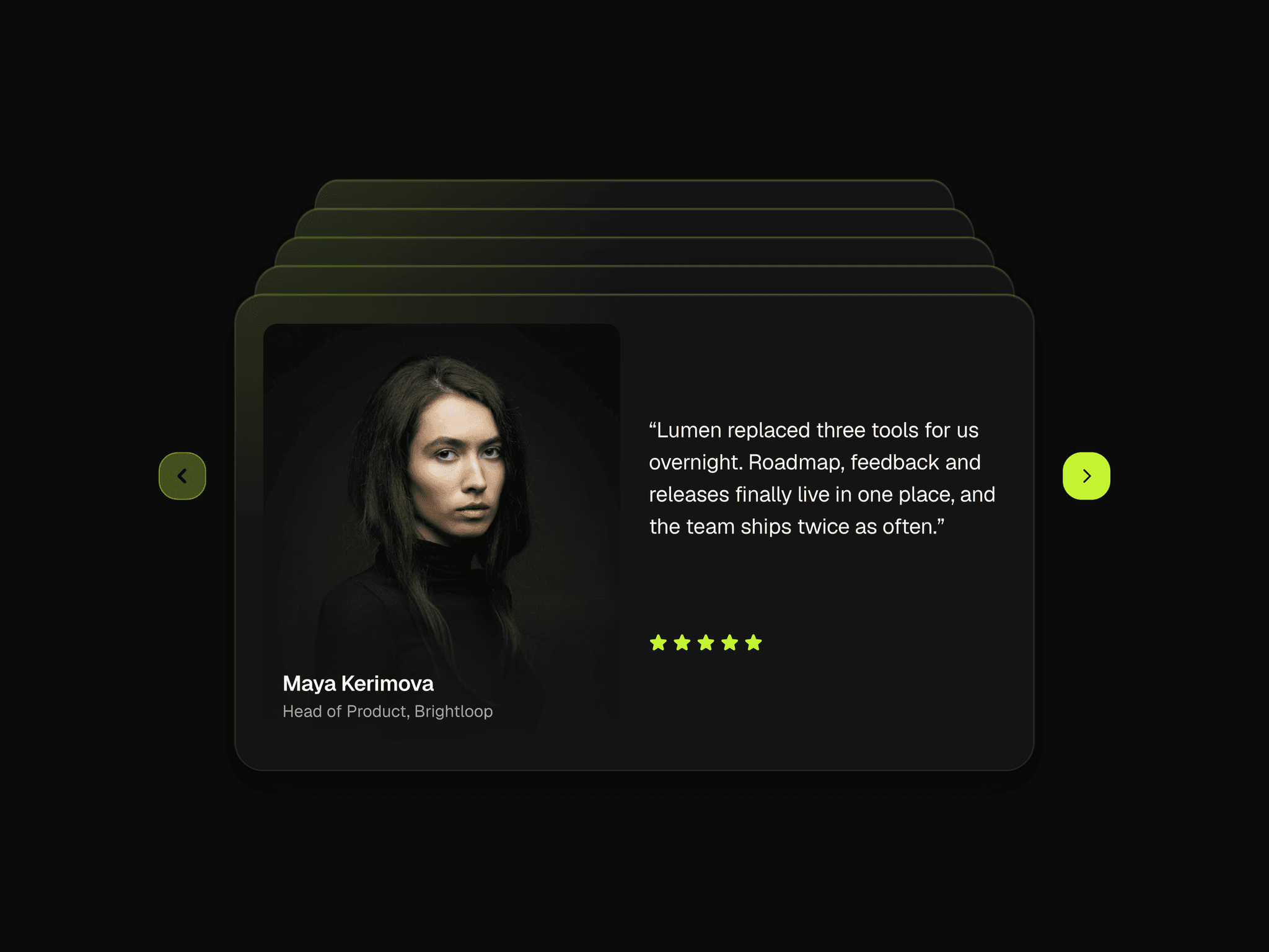
About Cards Deck Carousel
Stacked Card Slider turns any cards you design into a stacked deck. Cards peek out from behind each other, and the arrows send the front card away to reveal the next. Fully responsive and customisable down to the buttons.
Features
Works with any cards: testimonials, team, features, pricing.
Stacked depth that adjusts itself, so large decks stay clean.
Responsive: cards stretch to the available width, with separate Desktop and Mobile decks.
Smooth animation with adjustable duration and easing.
Custom buttons: 8 icon styles, colors, hover and disabled states, size, radius and border.
How to use it
Design your card. Create a card component with a Desktop and a Mobile variants.
Create your cards. Create a set of cards for Desktop variants and another set for the Mobile variants.
Add the carousel. Drop Card Deck Carousel into your page and set its width to Fill.
Connect the cards. Select the carousel, set Deck to Desktop and add your desktop cards to Desktop Cards. Switch to Mobile and add your mobile cards to Mobile Cards. Then set Deck back to Desktop.
Make it responsive. On your Phone breakpoint, select the carousel and switch Deck to Mobile.
Fine-tune each deck Each tab has its own settings, so you can tailor the either the desktop or phone layout separately.
Tips
Only need a single layout? Fill in just Desktop Cards.
Phone showing desktop cards? Set Deck to Mobile on the Phone breakpoint.
Support Questions, issues or suggestions?
Contact: centurionndesign@gmail.com


