About Aura Morph Button
About
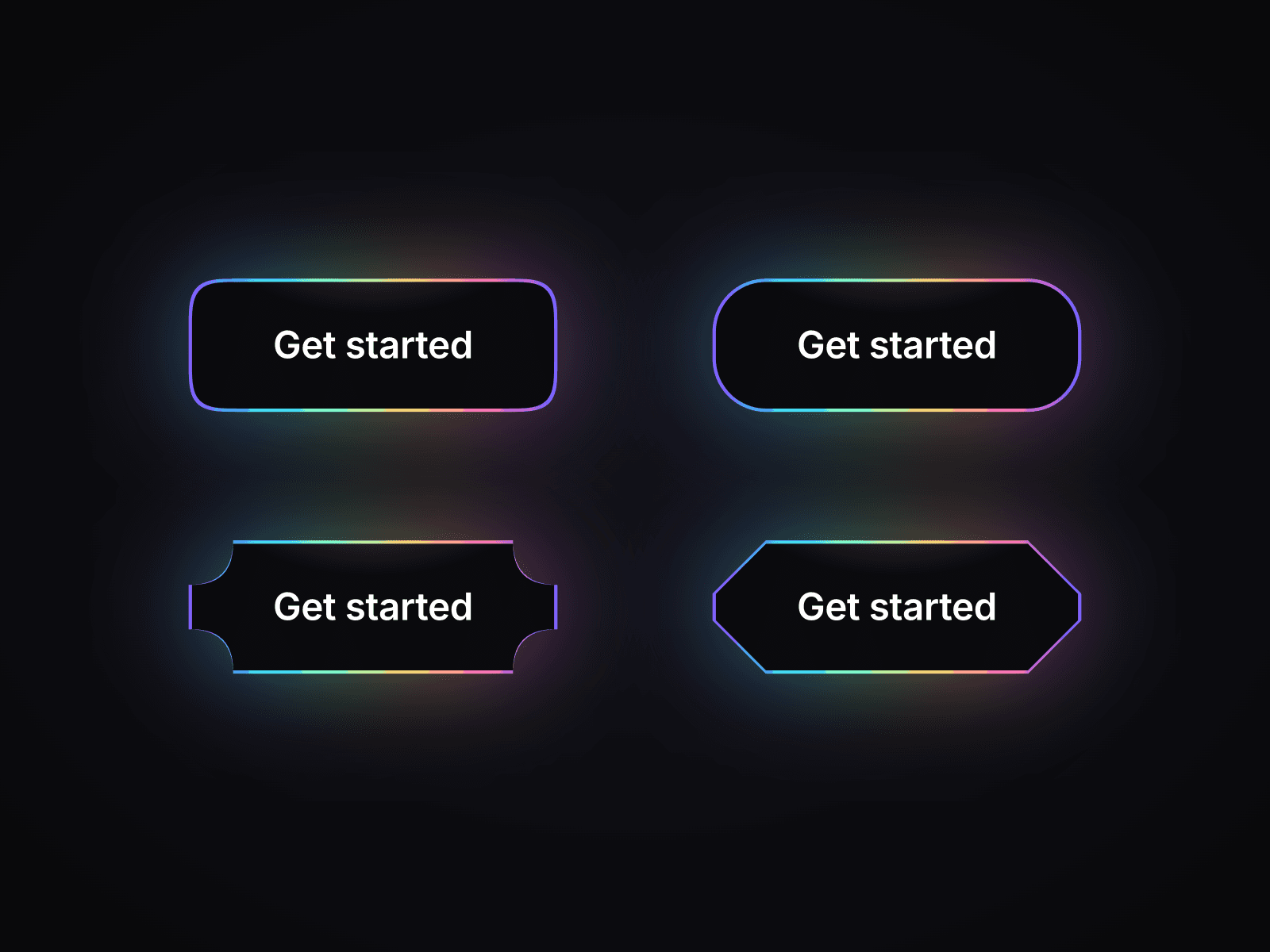
Aura Morph Button gives your Framer CTA a shape that never feels static. Its corners breathe at rest, morph in a clockwise wave on hover and shift again when pressed. A rotating gradient rim and glow follow the changing outline, while an optional expanding echo finishes each click.
Choose from Squircle, Round, Bevel, Scoop, Notch and Square shapes, or create your own with custom curvature. Assign different shapes to idle, hover and pressed states for subtle or expressive interactions.
What you can customize
Set your label, link, new-tab behavior, font, text color, padding and individual corner radii. Choose up to eight gradient colors and adjust the fill, highlight, rim width and glow.
Control breathing, corner-wave delay, gradient rotation, hover speed, morph transition, press scale and click echo. The button hugs its content or fills your chosen dimensions, with the contour adapting to its size.
Built as a Framer code component with visual property controls, keyboard focus, touch feedback and reduced-motion support. No code editing needed.
Great for (examples)
Give a primary action its own visual identity:
SaaS signups and product demos
AI tools and software landing pages
Startup launches and waitlists
Hero CTAs and featured product links
Creative portfolios and studio websites
Event registration and campaign pages
Gaming brands and experimental interfaces
Dark websites and gradient-led designs
Share your build
If you ship something cool with it, post it on X and tag me @Matthias_Oel, or send it over. I’d love to see what you create.
Need help?
Questions or feedback? Reach me anytime: matthias@lmvision.de or on X @Matthias_Oel.
Need a matching component?
Pair expressive motion with a metallic finish: