About Spotlight Quotes
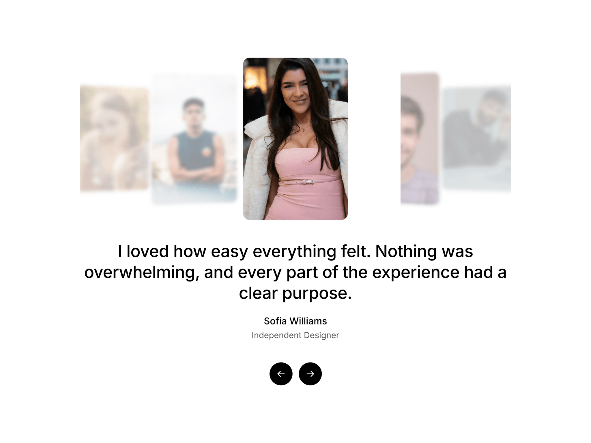
Spotlight Quotes is a testimonial carousel that puts one voice in the spotlight. The active card sits in the center at full size and full sharpness, while the cards around it shrink, fade and softly blur. Visitors read one quote at a time and still see a full wall of social proof.
Below the cards, the quote, name and role change with a gentle crossfade, and two clean arrow buttons keep the controls simple.
How it feels
- Drag or swipe and the cards follow your finger or cursor, then settle with a soft spring
- Flick for momentum, or use the arrow buttons, arrow keys, horizontal trackpad scroll, or click any side card
- Optional infinite loop, autoplay with an adjustable interval, and a start position
- Optional 3D tilt on the side cards
- Respects reduced motion settings
What you can customize
- Testimonials: image, quote, name and role for every entry
- Card width, height, corner radius and gap
- Side card scale, opacity, blur and rotation
- Fonts and colors for the quote, name and role
- Button size and colors
- Background color and padding
- Spacing between the cards, the quote and the controls
How to use
1. Copy the component URL and paste it onto your Framer canvas.
2. Select it and open the properties panel.
3. Add your testimonials and an image for each one.
4. Adjust card size, side effects and typography to match your brand.
5. Preview, then publish.
Tips
- Use images around 600 to 800 pixels wide to keep things light
- Works with Fixed, Fill or Fit width, and the cards scale down on small screens
- The quote text automatically matches the width of the card row
- Use five or more testimonials so two cards show on each side of the center
- Set Side Blur to 0 for crisp side cards
- Turn Loop off and the arrows dim at the first and last card
Great for landing pages, SaaS sites, agency and portfolio pages, and any section where social proof deserves more than a plain grid.