About TINKR
The site feels like a sleek, modern gallery for ideas, part manifesto, part calm command center. It’s minimalist but warm, with a quiet confidence that says “we’ve figured out the messy stuff so you don’t have to.”
Visual mood
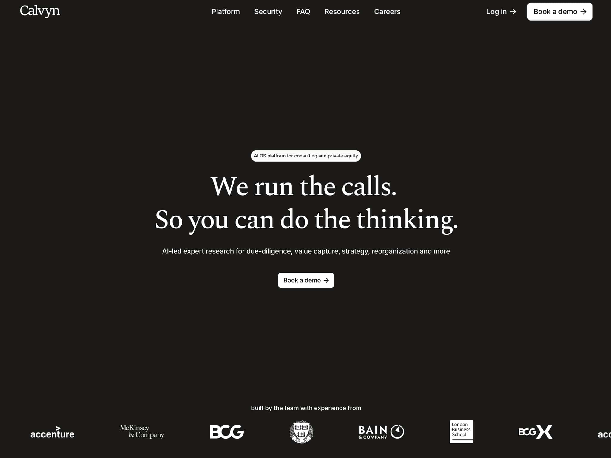
Monochrome backbone: Mostly black and white with generous breathing room. The contrast is crisp, like a well-lit studio wall where the work itself becomes the focal point.
Sculptural accents: A recurring “white sphere among curved black metallic ribbons” gives it a gallery-object vibe, clean, almost futuristic, but not cold.
Typography as rhythm: Big, declarative headlines break into short lines, creating a staccato reading pace. It feels more like walking through framed statements than scrolling a typical SaaS page.
Flow and feel
Narrative over noise: The page unfolds like a story, problem, reality, solution, outcome, so you’re led by logic and momentum rather than pop-ups and hype.
Calm density: There’s a lot of substance, but it’s chunked into digestible blocks with clear headers and short sentences. It reads like a thoughtful brief, not a sales pitch.
Human scale: Testimonials and the “founder-led studios” framing keep it grounded. The tone is partner-like, not vendor-like, more “let’s redesign how work moves” than “buy our bot.”
Personality
Quietly bold: It doesn’t shout with color or motion; it persuades with clarity and structure. Think black turtleneck energy, minimal, intentional, a little architectural.
Craft-first aesthetic: The restraint suggests a studio that values thinking and systems over flashy effects. The visuals support the message: less coordination, more craft